Tale of the Sizzling Beast: Grillzilla

Who are Grillzilla?

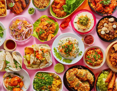
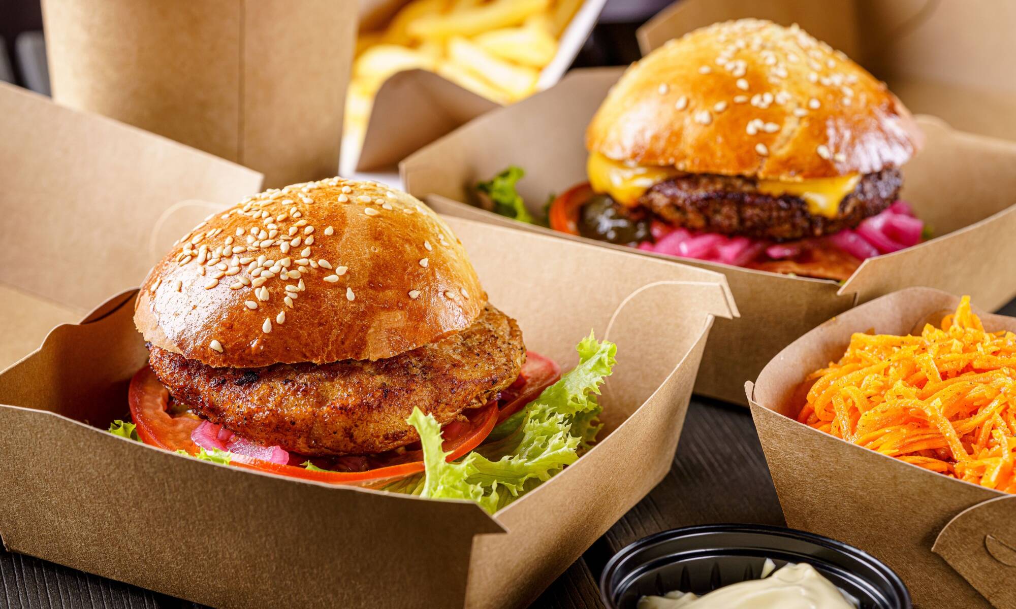
Grillzilla began its journey in the heart of Derby city center in 2015, bringing people together over delightful piri piri chicken, burgers, wraps, and American-style fried chicken. More than just a place to dine, Grillzilla is a warm haven where freshly roasted coffee and delicious cake are lovingly served too.

With open doors and even wider hearts, Grillzilla warmly welcomes couples,  families, and large groups, ensuring there’s something special for everyone to enjoy.

How we came to work with Grillzilla 

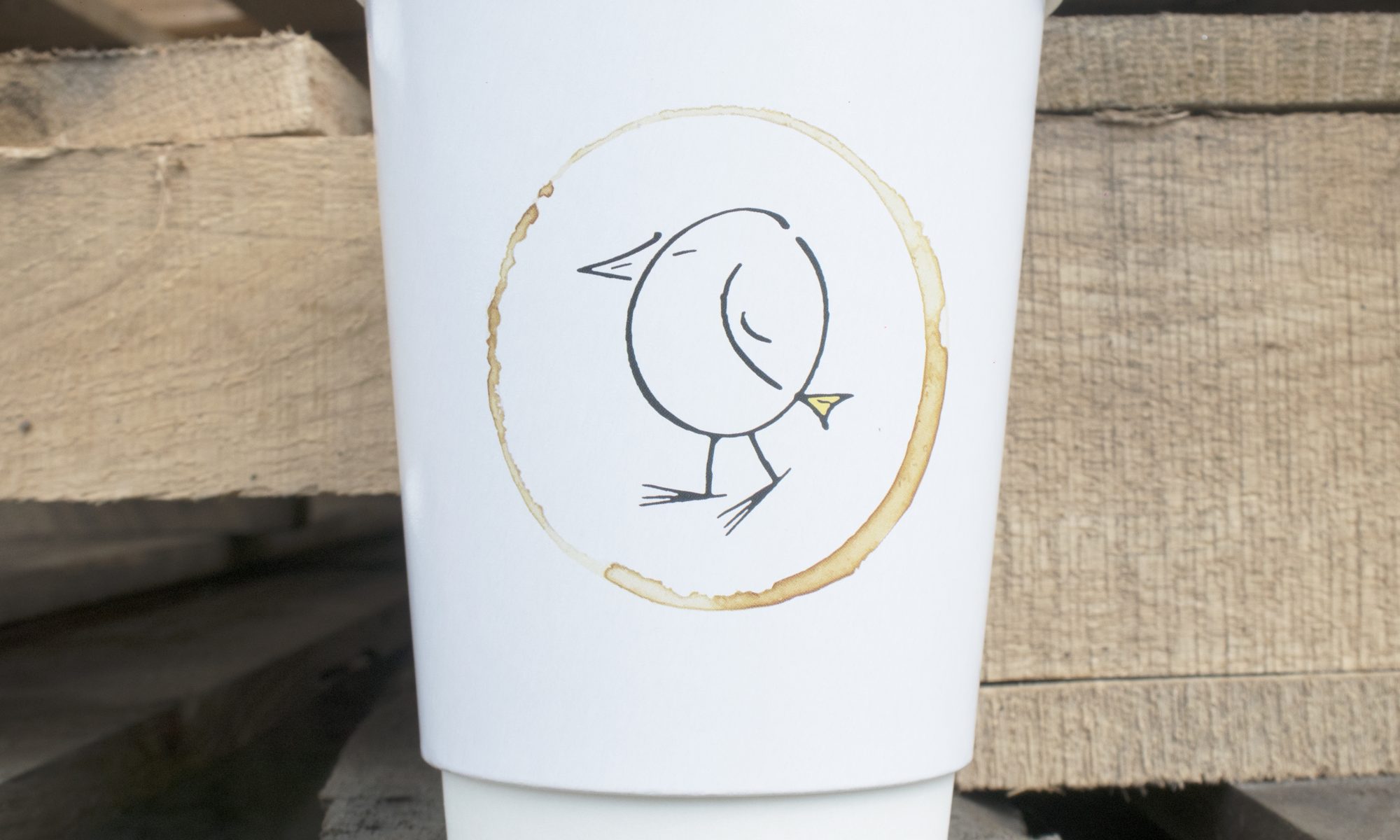
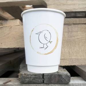
Thanks to trusty Google, the founder of Grillzilla discovered us while looking for branded coffee cups online. They requested four different sizes of double-wall cups with their logo and decided to kick things off with a small production run to see how they’d go.

Initially, things didn’t go as planned—there was a little blunder at the factory, and the artwork ended up looking like it had a bake-off with Picasso. But hey, who hasn’t had those days, right? We believe it’s all about how you bounce back! The moment we caught wind of the mix-up, we sprang into action and whipped up a fresh batch of cups in less than 3 days, and it goes without saying, this didn’t cost Grillzilla a penny more.

It’s not just about cups! 

Images courtesy of Grillzilla

In the past few years, Grillzilla has become quite the cup connoisseur, slurping up more of our branded beauties than ever. And guess what? We’ve been slicing down those unit costs (you won’t find any devious price hikes here!).

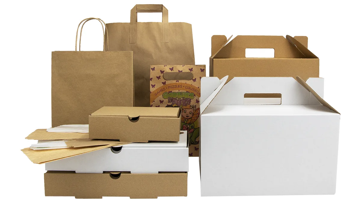
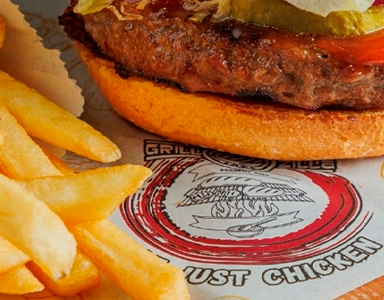
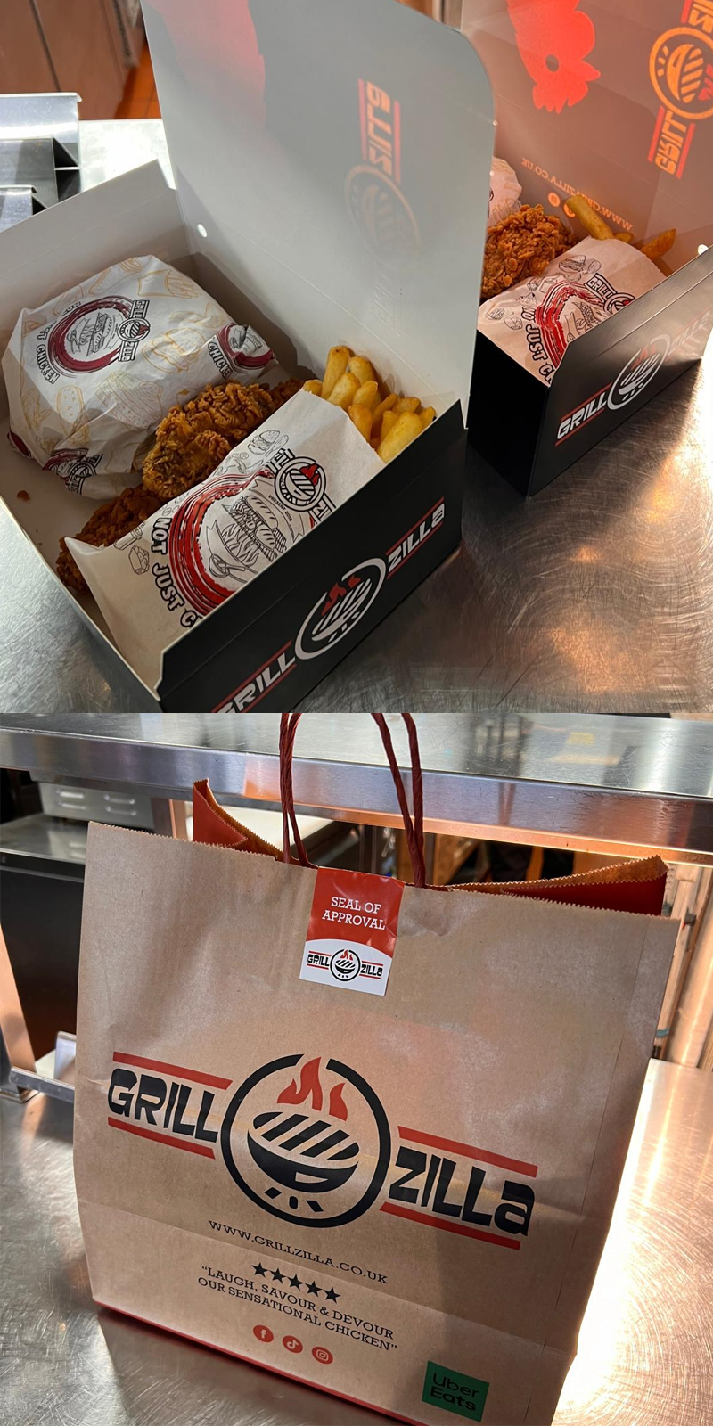
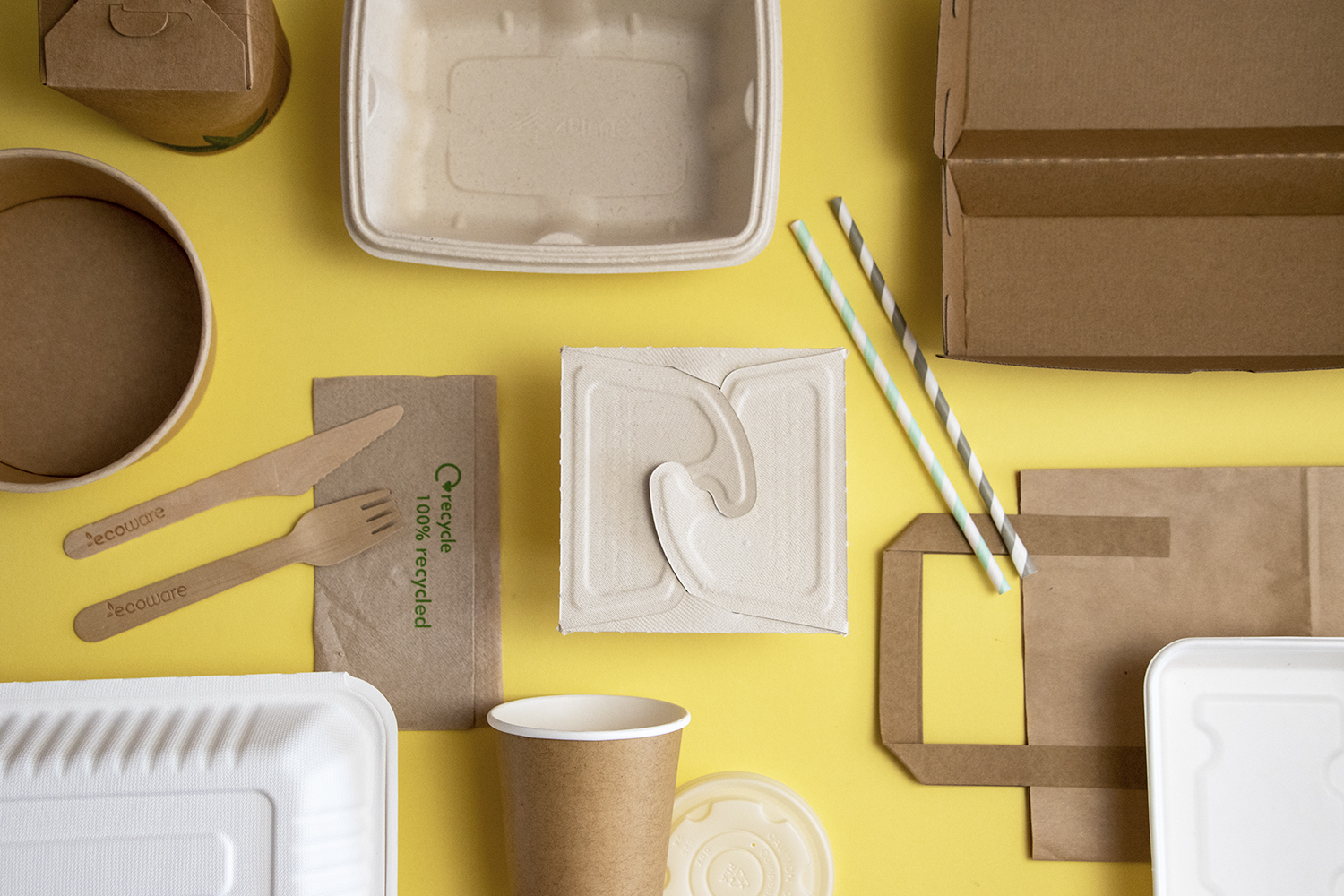
But, we don’t stop at coffee cups! We make sure Grillzilla is all set with everything they need for takeaways and deliveries. From custom-sized tubs, bags, boxes, and greaseproof paper to greaseproof chip bags—each one crafted to perfectly fit their delicious platters, burgers, fried chicken and more.

What sets Takeaway Packaging apart, you ask?

Well, let’s talk about those chicken boxes. We teamed up with Grillzilla to craft 4 sizes of custom boxes that keep your food sizzling hot without turning it into a soggy mess. Think of them as the superheroes of packaging—embossed and printed with flair! With a little help from our in-house design wizardry, we whipped up artwork that complements their logo like Grillzilla’s hot sauce does their chicken tenders.  These boxes were put through their paces, and Grillzilla is absolutely thrilled with them, so we were excited when they asked us to create another range of sizes!

Let’s not forget to mention their bags! From a lineup of grab bags in all shapes and sizes to a family-sized takeaway bag flaunting a bold red twisted handle. This bag’s got muscles—strong enough to haul even the most ambitious of takeaways without batting an eyelid! 

We all need a little extra

On top of taking care of their packaging needs, we gave Grillzilla a hand when they faced a storage hiccup. Now, we keep all their stock safe and sound in our facilities, and they trust us to keep an eye on when it’s time to cook up the next batch of packaging. All Grillzilla has to do is give us a shout when they need a delivery, and we’ll have it zooming up the M1 by the very next day!

How has packaging from Takeaway Packaging helped Grillzilla?

Grillzilla’s snazzy packaging has been a smash hit with their customers, giving their brand a high-five, keeping the food hot and scrumptious, AND it’s crafted from 100% recyclable materials—making it a breeze for customers to part with responsibly. They’ve even snagged some rave reviews about their eco-friendly style. Talk about wrapping things up nicely!

What Grillzilla has to say:

“From the Beginning I was lucky enough to deal directly with Tina she was really helpful and understanding, for us it was our first time with branded packaging, but not to worry we were in safe hands, thanks to Takeaway Packaging we were offered advice and help at every stage, even though we had to change our mind few times they were understanding and adaptable to Grillzilla needs. This was our best marketing investment since we opened, now we are confident in our product presentation and quality.

This is only the beginning, we as a brand want to take our takeaway business to a different level, with Takeaway Packaging’s help we hope to see Grillzilla a national brand and great British start-up story that goes worldwide” – Grillzilla
Brilliant Branded Packaging for Mór Bakehouse
Mor Bakehouse Blog image

Nestled in the heart of Edinburgh lies Mór Bakehouse, a culinary gem celebrated for its homemade delights. With three locations across the city, the bakery, deli and coffee shop prides itself on its delicious pastries, pies, sausage rolls, and freshly made wraps and baguettes, made with only the best locally sourced Scottish ingredients. Their coffee deserves an honourable mention, too — serving their own artisanal blend from local coffee roasters. 

In 2022, Mór Bakehouse approached the team at Takeaway Packaging as they wanted a branded packaging experience that resonated with their brand. We were all too happy to deliver on competitive prices, fast delivery, and a commitment to eco-friendly products that met and exceeded the demands of Mór Bakehouse’s thriving business.

Keep reading to learn how we collaborated and helped craft distinctive branded packaging for bakery products that are as practical as they are useful.

What Packaging Does a Bakery and Deli Need?

With a diverse range of food and drink available for takeaway and delivery services like Deliveroo and Just Eat, Mór Bakehouse needs a variety of bakery packaging to keep their food fresh and easy to eat while on the go. Let’s dive in and take a look:

Coffee Cups:

Mor-Bakehouse-branded-Paper-cups-2

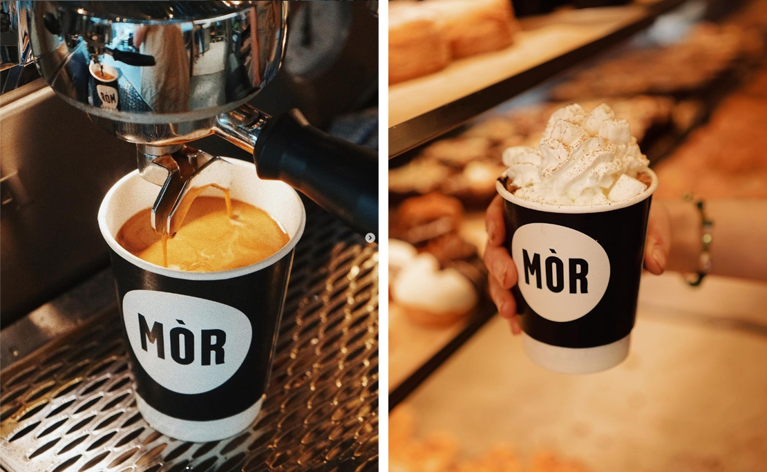
Coffee cups are essential for any coffee shop, and choosing to brand them is a clever, low-cost way to introduce branded packaging to your business. Mór Bakehouse chose a simple yet eye-catching style of a black coffee cup with their brand name in contrasting bold white letters to the front, making it instantly recognisable.

If you’re looking for branded coffee cups for your business, It’s super easy to order from us. Delivery is fast, and the quality of our sustainable cups is second to none. You can even choose from white or black eco-friendly lids to complement any style.

Shop Branded Coffee Cups

Greaseproof Paper

Mor-Bakehouse-branded-greaseproof-paper-copy

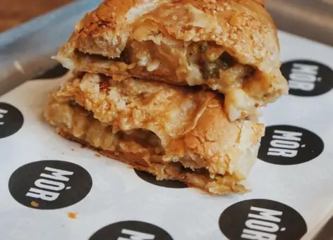
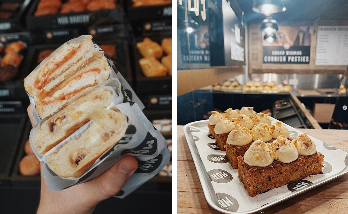
Mór Bakehouse uses printed greaseproof paper to line trays for sweet and savoury delights and wrap other takeout items like toasties, burgers and muffins. For this product, they opted for white paper, and their brand name and logo are in black, dotted across the paper. This simple yet distinguishable design means that their brand is always right and centre when customers are enjoying their tasty treats. 

Printed greaseproof paper is another fast and effective way to showcase your brand in-store and when selling takeouts. As an added benefit, it’s even 100% biodegradable.

Shop Printed Greaseproof Paper

Stickers

Mor-Bakehouse-branded-Printed-Stickers

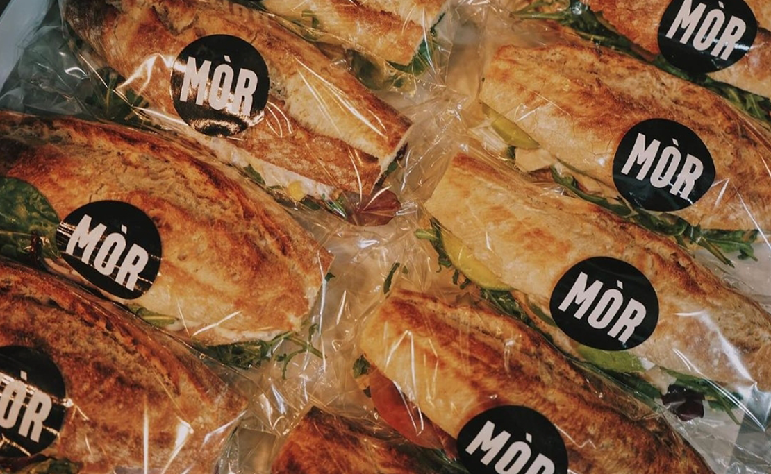
Branded stickers can be used to unify your off-the-shelf packaging and are often a great starting point for small businesses looking to implement branded items. We love Mór Bakehouse’s choice to print their logo in sticker form and how they use it to add an identifiable touch to otherwise plain sandwich bags and bakery packaging.  

Stickers are so versatile that they can be applied to cups, bowls, sandwich bags, takeout bags and food containers. Not to mention, they’re also cost-effective!

Shop Branded Stickers

Greaseproof Bags

Mor-Bakehouse-branded-greaseproof-bags

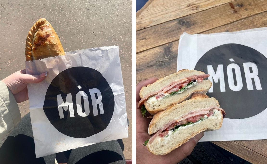
Greaseproof bags are a convenient way to dish up freshly baked goods, hot pasties or warm baguettes. Mór Bakehouse put their brand front and centre with white greaseproof bags and a large black logo showing everyone exactly where they can get the tastiest treats in town. 

While minimum order quantities are higher than the products above, they prove cost-effective when ordered in bulk and are a great marketing tool for your business. 

Contact Us to Order Printed Greaseproof Bags

Kraft Bowls

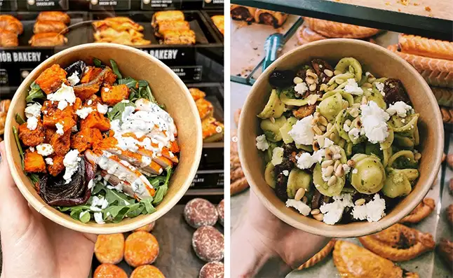
Kraft bowls are perfect for serving up Mór Bakehouse’s fresh and healthy pasta and salads. They can be used for both hot and cold foods, making them a highly versatile solution for their many delicious food options. 

Kraft bowls look stylish on their own, thanks to their rustic and modern appeal, but we think they look even better printed with the Mór Bakehouse logo, which ties in with the rest of their takeaway packaging perfectly.

Contact Us to Order Branded Kraft Bowls

Takeaway Packaging and Mór Bakehouse: A Year On

We’re delighted to still be working with the team at Mór Bakehouse a year later. We now supply a comprehensive range of branded and non-branded packaging and have gone above and beyond to meet the needs of their growing business.  

What Mór Bakehouse Has to Say:

“Takeaway Packaging are the best in the business; they have assisted us with all of our packaging needs at Mór Bakehouse. I would highly recommend their team to all business owners.“  – JM Mór Bakehouse

Branded Packaging for Your Business

At Takeaway Packaging, we’re proud to offer a broad spectrum of low-cost, low-volume branded options, a wide range of keenly priced off-the-shelf packaging and competitive unit costs for high-volume branded food and drink packaging.

Sustainability is at the core of everything we do; that’s why all our packaging options benefit from being plastic-free and are recyclable, compostable or biodegradable, and we only print using vegetable-based inks. With our packaging for bakery products, not one crumb will be left behind when your customers are finished with your food and beverages, not even the packaging they came in.

Get in touch with us today and start your branded packaging journey. We’re here to help you create a memorable packaging experience that enhances your brand identity. 

Custom Branding – Promote your brand on our Takeaway Packaging

Takeaway Packaging produce bespoke food packaging and supplies, all tailored to your requirements and designs. We provide a fully comprehensive service and offer support to our clients from initial concepts all the way through to delivery. Our expertise allows us to work closely with you to create visually appealing products for your business.

Continue reading “Custom Branding – Promote your brand on our Takeaway Packaging”
How Do Designer Food Packaging and Caring for the Environment Mix?
How Do Designer Food Packaging and Caring for the Environment Mix

If something is a designer item, it has to be overboard and all about the image — and it absolutely cannot be considerate towards the environment, right? Wrong. Despite some high-end brands giving the luxury market a bad ethical reputation, designer packaging can cater to the conscious consumer in any sector — including food packaging.

If something is designed, it simply means is that it has been developed with great care and a clear target customer in mind. This is the case for our bespoke packaging, which is developed by our in-house teams of designers to create environmental food packaging that stands out for the customers of quirky brands. In this blog post, we will discuss how a careful design process can tackle our food packaging problems by offering sustainable yet stylish alternatives.

How Does Food Packaging Affect the Environment?

There is plenty of evidence to show that food packaging and the environment have a strained relationship, to say the least. As a result of our throwaway culture and reliance on convenience comforts, we have created some shocking food packaging waste statistics. Most notably, there is predicted to be 12 billion tonnes of plastic waste in landfill by 2050. The most severe food packaging problems affect the earth’s natural environment, polluting our oceans and negatively impacting sea life.

In short, something needs to change in food packaging to protect the environment for future generations. Crucially, we need to eliminate the use of harmful plastic in food containers and other packaging products so that Brits can feel less guilty about their takeaways. But on top of this, brands still want to use their packaged products to inject some personality into their offering. Environmental packaging needs to be designed with care so that it both protects the environment and promotes the supplier.

Can Designer Food Packaging Still Be Recycled? 

Yes, designer food packaging can still be recycled. In fact, basic packaging from your average takeaway is most likely made from harmful plastic.

A tip for consumers deciding to buy: a brand is less likely to put its name on something if it would be ashamed of its impact on the environment. In this sense, branded food packaging is more likely to be 100% recyclable, biodegradable and compostable (but always check for certified UK recycling symbols to make sure).

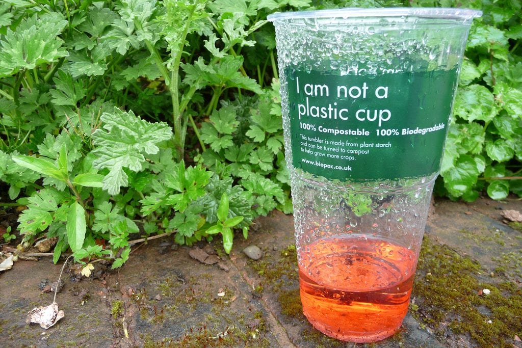
By using different packaging materials for food, such as the Ingeo™ PLA Bioplastic used in our biodegradable coffee cups, we can create food packaging that is 100% recyclable. We use vegetable-based inks to print bespoke designs on these cups (and various other products in our range) so that designer food packaging can blend seamlessly with caring for the environment.

How Can We Reduce Plastic in Food Packaging and Make Sure It’s on Brand?

Others are now understanding the importance of packaging to the environment and rephrasing what luxury means by prioritising sustainable strategies. The purpose of food packaging is shifting from simply being a container for food to being a driver for change and an effective tool for promotion.

Some of our most successful clients have embraced the traditional eco look by sticking with brown paper cups and a simple logo, like Cobbs Farm. Others have stayed true to their roots, embodying their iconic designs while using sustainable packaging, although you wouldn’t know it unless you were told (much like Ferrari’s 70th birthday burger boxes). This proves that sustainability never has to get in the way of style and that opting for environmental food packaging is a choice that won’t tarnish your brand image — in fact, it might even enhance it.

Create your own stylish and sustainable food packaging that doesn’t harm the environment by booking your free design consultation. Our expert team of in-house designers will help you to develop a creative brief for food packaging that pops.

A Brief History of Chopsticks: Dos & Dont’s
chopsticks diner

Chopsticks have been around for centuries and, of course, they’re ubiquitous in Asia.

Actually, the sticks as we would recognise them today go back as far as the late Shang Dynasty.

In case you didn’t know, that was 16th-11th century BC, so just the other day…

In the early days, the Chinese word for Chopsticks was “zhu” 筯, and during that time, the tyrannical King Zhou ordered his craftsmen to make chopsticks out of elephant’s teeth which were deemed to be of utmost luxury in early Chinese culture.

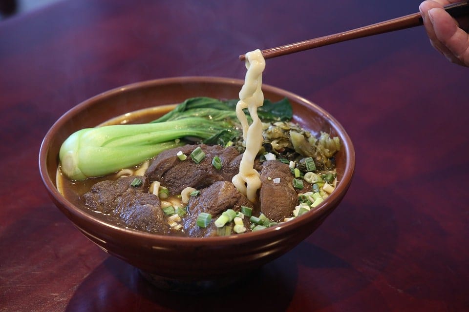
chopsticks beef soup

The rise of chopsticks versus early versions of the spoon which were just as prevalent in very early Asian culture, is largely thanks to the rise of wheat!

Millet and other such grains used to be the staple for most early Chinese meals, but as the growing appeal of wheat continued, so to did wheat-flour foods such as noodles and dumplings.

With a lot more in the way of noodles and dumplings knocking around, chopsticks were clearly a much better tool than the humble spoon.

There’s an old Chinese proverb which gives testimony to the above: ‘you are what you wheat’.

Ok, sorry about that – here’s what you should know about using them:

chopsticks etiquette

Dos & Don’ts

It seems to be that chopsticks are no longer the novelty that they used to be and Asian restaurants are far less likely to assumptively provide silverware to their Western diners.

So with a modest 7,000 years worth of dining history behind them, there must be some etiquette rules around using chopsticks, right?

Well, there are loads!

Here’s a quick run down of the main ones that should see you through to the end of your meal and warmly welcomed back to dine again in the future.

Do take food from a serving bowl and place it in your bowl before eating – patience will serve hungry diners well here!

Don’t wave your chopsticks around or use them to point or gesticulate at someone.

Do place them on top of/across your bowl horizontally when not using them but DON’T cross them – crossing chopsticks is very taboo and a symbol of death…

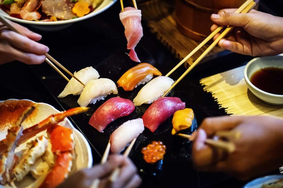
chopsticks sharing

Don’t stick them into your food vertically as this is reminiscent of placing incense in rice at the altar during a funeral!

Don’t pick through food with your chopsticks looking for which item to choose from a shared serving plate, have conviction and commit.

Don’t suck the tip of your chopsticks – yes, even if there’s some amazingly tasty sauce left on it! This will see you ridiculed in front of everyone as someone lacking a family education…

Do hold the bowl in your hand and use your chopsticks to push rice into your mouth, if you need to.

Don’t do that if you’re in Korea.

Do NOT pierce pieces of food with your chopsticks, this is very rude!

Don’t pass food to another person chopstick to chopstick, that’s also a funeral ritual…

Don’t break apart wooden chopsticks and rub them together – this is because people would often do this with cheap wooden chopsticks that splinter. Doing so with any pair of chopsticks tells the host you think their chopsticks are cheap!

Remember those and you should be just fine!

chopsticks resting

Considering upping your chopstick game or perhaps introducing some Asian cuisine on your menu?

We can help!

We sell traditional yet modern chopsticks that are packed with potential.

Our custom branded chopsticks are a handy utensil for your takeaway customers and those dining in.

We can print the chopsticks sleeve with your artwork and logo to increase your brand’s presence.

Printing your chopsticks or chopstick sleeves can be an effective and visually appealing way to increase brand awareness and are a fraction of the cost of other forms of branded takeaway packaging.

We produce both wooden, disposable and resin reusable chopsticks.

Get in touch and let’s have a chat about what we can do to help you.

Bespoke Compostable Coffee Cups
Did you know that we can brand compostable coffee cups?

Compostable Coffee Cups are no different to regular Coffee Cups, they are just lined with a different material called PLA.

What is PLA?

PLA, short for polylactic acid, is a 100 percent biodegradable and compostable material that we use to line our coffee cups. The material itself is made from a substance found in plants.

Wogan Coffee Compostable Coffee Cups

The Process

If you’re buying your branded coffee cups from us, the process is very straightforward!

Step 1: Initial Concepts & Details

The first step is easy, we simply need to know the size and style of the cup you are after, i.e. 12oz Double Wall Cup or 4oz Single Wall Cup. We will also need to know the quantity you are looking to buy, the larger the quantity, the cheaper the price per unit!

Step 2: The Design

You’ll be please to know that we offer a comprehensive design service, this covers anything from a simple logo placement to full hi-resolution artwork. If you already have your artwork, that’s great! We can also use your artwork to produce your coffee cups.

Bespoke Compostable Coffee Cups
Step 3: Ordering

Once you are satisfied with the design, we will produce your compostable coffee cups. Please note that lead times do vary*.

Step 4: Delivery

Once your cups have been produced we can deliver these to you as and when and as you wish. We can stock hold for up to 3 months dependent on your usage*.

Talk to us today about branded compostable cups, you can call us on 01753 655 344, send us an email on [email protected] or send us a message here.

Like this blog? Read all about our biodegradable ice cream cups here.

Keep up to date by following us on social media.
@TakeawayPack on Twitter
@takeawaypackaging on Facebook
@takeawaypackaging on Instagram
Contact Us
Sign up for News & Special Offers

How to Design Packaging for a Subscription Service
subscription service design

Something which comes up an awful lot in the packaging channels of this world, is how best to design packaging suited to a subscription service.

Given our love of all things design and packaging, we thought we’d share some core tips on the sorts of things you need to consider about your packaging designs.

Using the example of a box, this will range from the dimensions of the box to the type of box used.

We follow with some pointers around graphic design and also cover the often overlooked aspect of enhanced advertising.

Many businesses will tell you that it’s often very easy to get carried away with the design elements of a new packaging idea.

While it’s fundamental to the success of a brand’s image and perception, it’s not all about design – choosing the right style and size of the box can hugely impact your profitability.

Subscription service gift

Size Matters – Think Inside The Box

Make sure you’re clear on exactly what will be going in the box or packaging each time you send it and try to use as small a box as possible.

This will help you in a number of ways:

Lower costs on manufacturing and materials (namely cardboard).

A smaller box, and subsequently a reduction in the weight of the box, leaves more allowance for weight of the items themselves, resulting in lower overall shipping costs.

Client retention: customers will perceive the contents to be of greater value – the smaller the box, the fuller it seems

Whereas, if your box is too big and there’s too much space for your products, it will seem underfilled.

In cases where you need to send larger packaging to accommodate an anomaly item, go for two!

Even with two on the odd occasion, you’ll find that you still achieve a saving on your shipping costs – 11 months smaller box and 1 month two boxes.

subscription service items

What’s Your Style?

There are a lot of factors to consider here:

Is your box suitable to ship as it is, or will you need a secondary box to ship it in?

What about the style?

Keep in mind your budget here: 2-piece trays tend to give an impression of higher quality but this might mean you need to use a secondary shipping box – increasing your shipping costs.

On the other hand, tuck-fold closures are great for rapid production. You can cut down on labour and packing time by packing in advance.

One great tip is to use the shipping label as the securing tape.

Holding on to the pennies? Then the classic stock box aka one-piece folder cut-out might be the right option for you.

However, if you want a custom, non-stock shape then you may find you need to purchase the box-shape-cutter itself, once you’ve had it made.

Office subscription service

Think Outside The Box

The best way to think of your box is as a piece of directly mailed advertising with a 100% engagement rate!

It’s like sending an email you know is going to be opened.

This is your opportunity to sell through your packaging.

It’s completely up to you what elements you include, whether calls to action, offers or incentives.

Think social media sharing prompts, upsell offers or refer a friend options as great ways to increase sales.

Whatever it is, remember to test and measure.

subscription service design

Graphic design & Artwork

Creating your own artwork is extremely rewarding but equally time consuming and difficult to do if you want a really professional finish.

If you don’t have an in-house graphic designer, then don’t despair!

We have a team dedicated to designing and producing fully bespoke, personal designs that are the perfect representation of your brand.

Generally speaking, on the graphic design and printing front, the more varied and full of colour your design, the more it’ll cost to print.

Using laminate coverings can create a very clean cut finish suited to more premium-styled packages.

Stay aware of the different features, forms and styles as these will either hurt or boost your bottom line in different ways!

Subscription service art design

Partner Up!

At Takeaway Packaging we provide a completely custom packaging service to suit any brand.

With our packaging and design expertise alongside our legendary joke-telling and enviable good looks, we make the perfect partner for your subscription packaging service.

To find out much more about the options available, drop us a line and let’s chat!

How to make your packaging stand out from the crowd
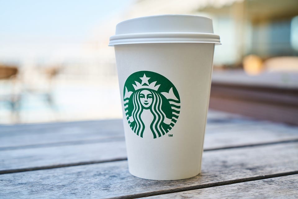
Starbucks packaging

The Starbucks logo is a globally recognised icon and one which surrounds the household name.

A familiar face to crowded high streets with a calming-green background, it’s undeniable that Starbucks coffee cups stand out from the crowd… or is it?

Is it really fair to say that a plain white cup with a green logo jumps out of any picture or view and meets your eye instantly?

Probably not.

What is true, is that when you do see that green logo with the siren/maiden/lady thing, it’s unmistakably ‘Starbucks’.

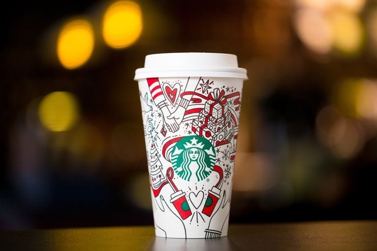
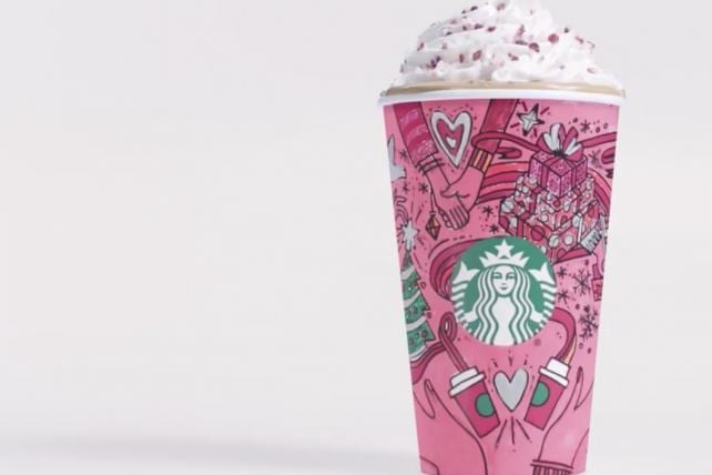
Last December, and piloted initially in the US, Starbucks launched a packaging campaign so great they gained the highest number of video views that season for their campaign advert:

Over 76 million views in under 1.5 months!

They beat all other brands across the whole period of Thanksgiving through to New Year 2018!

How?

They made their already iconic cup unusual and exciting.

Starting with an initial concept for the design of the holiday-season coffee cup, the cup featured seasonal, warming outlines of images of Christmas and merriment; wrapped presents, snowflakes and coca, all nestled around the Starbucks logo.

Starbucks pink packaging
Credit: Starbucks

Their short video, below, simply explained that you can “make the holiday your own” then featured the newly designed cup changing colours – you design your own!

The cups in the advert feature all different colour schemes, vibrant and bold.

Even if the cups were coloured in terribly, they would be an object of humour and still likely standout.

Artists and within-the-lines-perfectionists would have really gone for it, only for the cup to then serve as a work of art and, you guessed it, free, ‘boosted’ advertising for Starbucks!

The campaign ticked all the boxes for the consumer; interaction and engagement with the product/brand, something different, something exciting (adults get to be big kids), and most of all, something personal.


Top Tips For Standout Packaging

As with Starbucks, doing something different to other people similar to you, will go a long way towards making you standout.

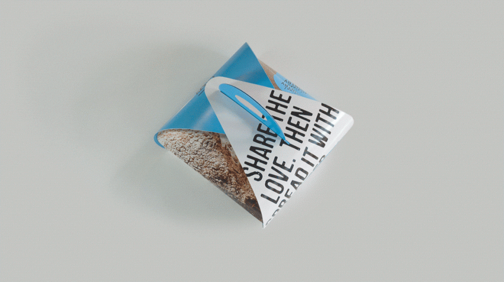
Though no longer trading, Californian-based bakers The Crazy Good Bread Co, are an example of a company whose packaging stood out because it was unusual:

standout bread packaging

Doing something slightly ‘against the grain’ will help you to get your packaging noticed, and that includes packaging your bread in a weird card holder thing.

Staying ahead of the curve is another way for your packaging to to stand out.

At a time when environmental concerns have never been higher, ensuring that you fully embrace the green/eco-friendly approach to waste and packaging will serve you really well.

Given that there are many, many businesses yet to do so, you will establish your brand as a conscious and progressive company that listens to its customers and considers carefully its own ethos and attitudes – this is a powerful consideration that certainly doesn’t go unnoticed.

Have a think about keeping it simple.

An effective way to make your takeaway packaging stand out from the crowd is to strip back your packaging.

Consider simple paper-wrapping techniques fastened and sealed with a sticker featuring a strong logo.

Stickers can be custom designed with your logo and the simplicity of the packaging will seem intriguing in its modesty and harks back to a more traditional approach to packaging takeaway food.


If you’ve got some ideas that you’re not sure of or you’re looking for inspiration to build on an already outstanding packaging concept then get in touch with our in-house design time who will be happy to bounce some ideas around and offer some advice.

4 Fast Foods Set To Take 2018 By Storm
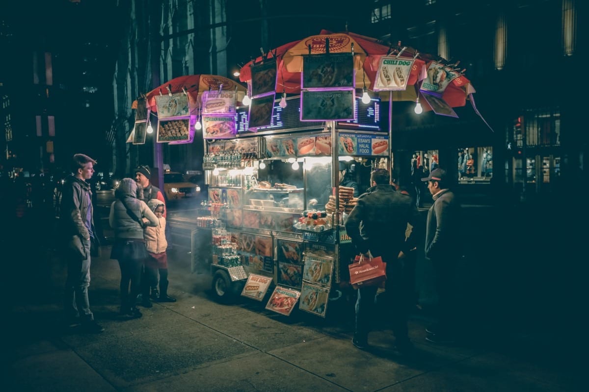
Street food packaging

There’s always an abundance of new fast foods to try. Whether it’s reborn again classics or healthy new concoctions from the latest hipster restaurant, fast food doesn’t just need to taste amazing; in the modern era it has to look amazing too.

Because fast food now has to satisfy another hunger: one for likes and comments on social media.

The importance of food aesthetics determines a large proportion of its popularity, but of course, there can be no sacrifice on taste.

Each year there are plenty of new food fads, here’s a rundown of some of our favourites you need to try in 2018.


Leon: Naturally Fast Food

Dubbed as the future of fast food, Leon is a rising star among fast food chains and the only feature in our list with a brick and mortar site.

Their founder wanted to move away from the realisation that conventional fast food “makes you fall asleep and wake up fat.”

Inspired by Mediterranean cuisine, think falafel wraps, mezzes, beautiful club salads and Sicilian chicken meatballs.

They cater for veggies, vegans, nut allergies, dairy and wheat intolerances, pescetarians, pregnant women, dieters, the adventurous and those who are really hungry.

Go to their website and be amazed at the future face of fast food outlets.

Takeaway fast food

“Indian” Street Food?

More than ever before there is a demand for new flavours, bold colours and exciting textures.

These days consumers want detail and specifics.

Simply saying “Indian” won’t cut it, foodies want to celebrate that their goat meat gosht dabal roti is from the Far-Western Indian Streets of Gujarat.

Globally there is an abundance of goat meat, and yet, in the UK it’s seldom found on our plates or in our takeaway curry boxes.

2018 will see a surge in UK-bred goat meat offerings which is erroneously referred to as mutton in India.

Keep your eyes peeled for curries, samosas, bajis and dahls all containing locally-farmed British billies.

Warming, spicy, and full of amazing flavours.

Many spots in London are serving spiced or mango-infused goat’s milk to wash down their spicy delights.

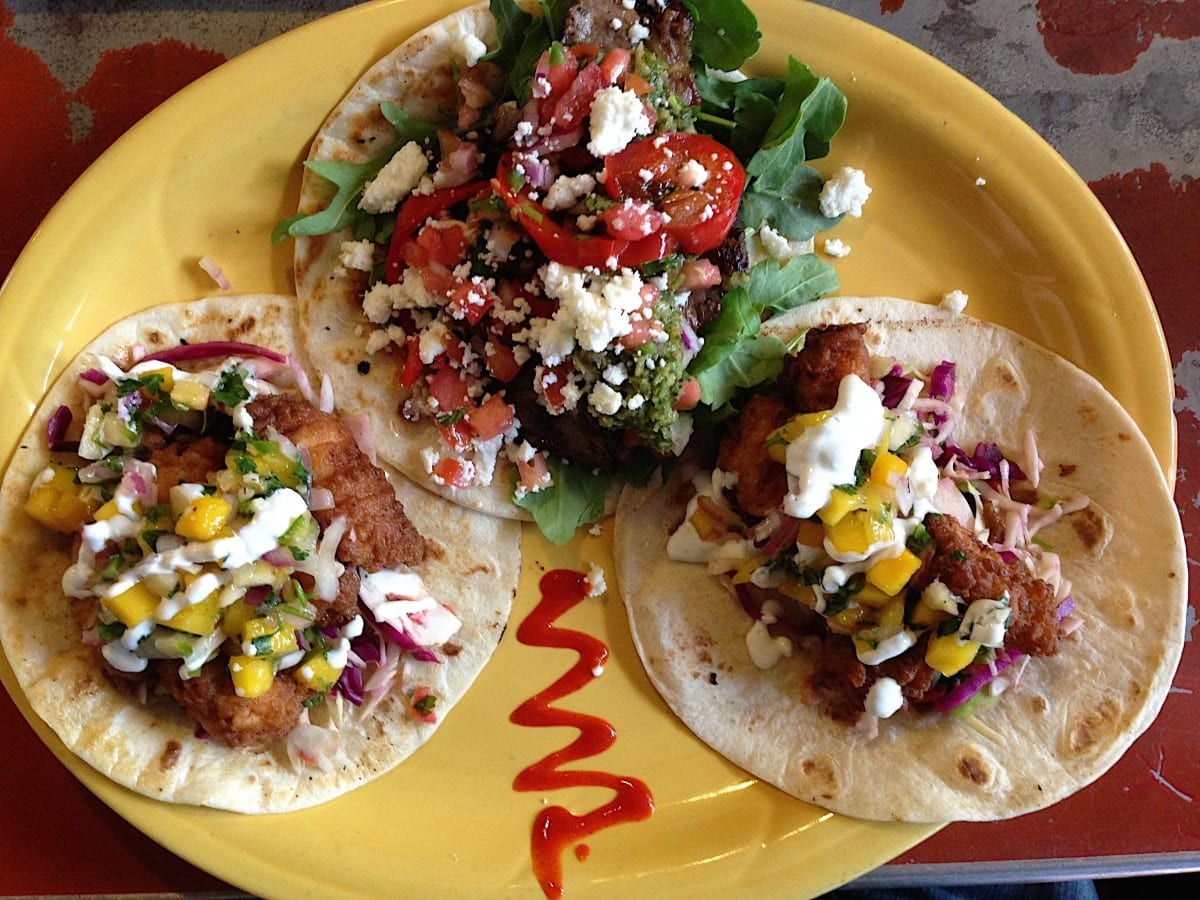
Fast food takeaway

Celebrate Vegan

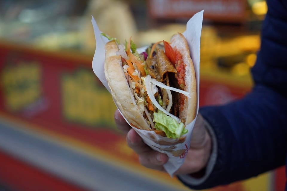
Doner kebabs have, for a long time, been a taboo in the UK, being mainly consumed as ‘drunk food’ for clubbers wanting to binge on greasy meat in pitta at 2am on a Sunday to soak up the night’s excesses.

How times haven’t changed.

Happily, while the not-so-authentically-Greek kebab vendors continue to serve their nocturnal market, vegans of London can have their kebab and eat it, even for lunch.

What The Pitta are based in Shoreditch (E1) and serve vegan doner kebabs crammed full with spicy soy meat, chilli, salad, hummus and tzatziki.

So popular is this animal-friendly street snack, that WTP are expanding and are due to pop up in two more popular London spots.

The best part? You don’t need to drink 10 jagerbombs before you eat one!

Vegan takeaway packaging

The Cholesterol Stroll

Let’s face it.

Healthy is good, but sometimes, it’s good to be bad.

If you like cheese, this one’s for you.

If you haven’t already been to South Bermondsey’s Maltby Street Market (SE1), then shame on you!

Set among the iconic railway arches and frequented by artistes, trendies and foodies, this market is a long alleyway which is, shockingly, unfamous.

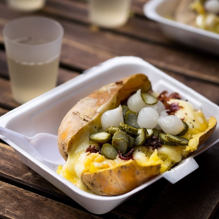
Meander your way through the crowd and get in line for The Raclette Brothers.

Hailing from the Savoie region of alpine France, traditionally this cheese would have been melted over fires, but the guys at Raclette Brothers use special raclette grills that allow them to scrape waves of cheese onto herby potatoes and pickles.

Of course, you can opt for the sausage option which inevitably disappears under a sea of cheese.

Don’t worry, it’s aggressively-topped with maple-bacon crumb.

The key to this incredibly indulgent delight is to simply not think about it, just enjoy it.

You will not be dissapointed!

Pour-overs and lashings of melted Raclette cheese gives a whole new meaning to naughty but nice.

Packaging for Fast food

If you’re running a pop-up outlet or thinking about a street stall this summer, talk to us about our range of bespoke takeaway packaging options to serve up your hip bites quickly and in style.

Our favourite fresh Juice & Smoothie Bars in London
Smoothie Cups, Juice Cups

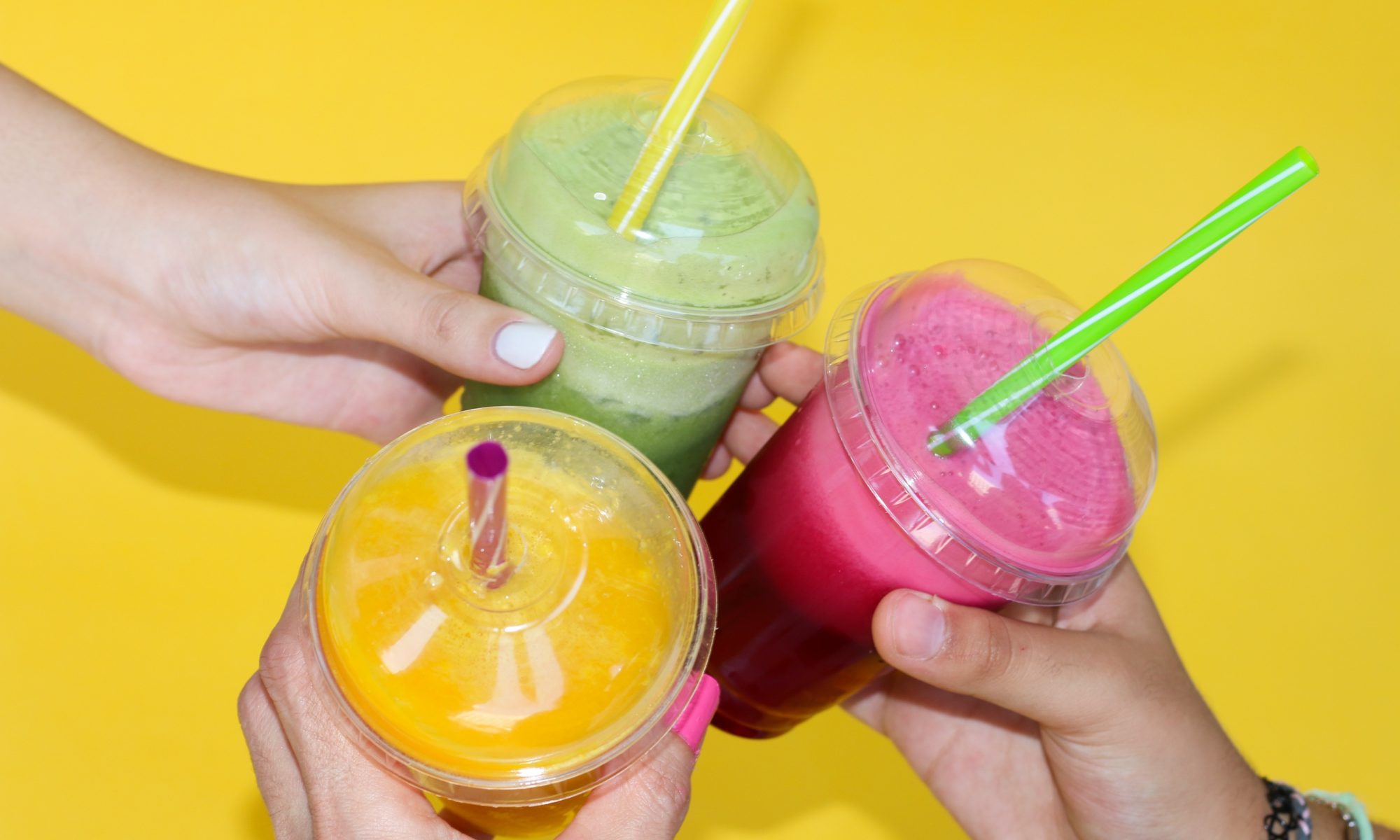
At Takeaway Packaging, we love Smoothie Cups…but we also love what goes inside of them! We’ve compiled some of our favourite Smoothie and Juice bars in London, let us know if you agree.

CYCLELAB & JUICE BAR

CycleLab & JuiceBar is an independent cycle shop with a remarkable café, offering fresh juices, smoothies, crepes and coffee. They also sell and repair bikes! Yoga fan? Every first and third Wednesday of the month they host Yoga classes from as little as £12 a session.
Visit their website

PORTOBELLO JUICE CAFÉ

Independent Café Portobello Juice Café is situated at 297 Portobello Road. They specialise in Juices, Smoothies and Super Smoothies. The Café only uses fresh fruits and vegetables from the local Portobello Market, sourced daily.
Visit their website

RAW PRESS

Raw Press is a health and wellbeing brand with 2 stores in Mayfair and Chelsea. They make raw, organic and cold pressed juices, nut milks, as well as salads, breakfasts and cleansing sets. We love their branding.
Visit their website

CRUSSH

Crussh is a large juice chain in London, specialising in made-to-order fresh juices, smoothies and salads. They press 10,000 raw juices every week and source all of their fruit and veg locally! Check them out.
Visit their website

JOE & THE JUICE

Joe & The Juice have locations all over the world (170 locations in 14 countries)! They are known for their great juice and employee parties, some even call it the future Starbucks! What do you think?
Visit their website

JUICEBABY

Juicebaby is a juice bar in Chelsea. All of their ingredients come from support local, organic farmers. They have launched some new matcha hot drinks today, and if you’re a fan of cleanses, they have five pressed juice bundles available to purchase online.

Visit their website

4 Packaging Design Trends of 2018
coffee cups of the future

The new year is upon us, time to make changes to your packaging for 2018.

Through a combination of our extensive industry knowledge (Takeaway-Packaging-inner-genius) and consulting a very large crystal ball in our office, we’ve been considering what will be in store for takeaway packaging in the next 12 months.

This article will tell you everything you need to know to have the trendiest packaging going!

In short, we’ve compiled the four major trends that are set to catch the eye of your customers in 2018. Here’s a run-down of creative ideas for those purchasing takeaway packaging which will ensure your packaging stays bang-on trend and ahead of the game.


Nostalgia – Old Fashioned & Retro Packaging

It’s not hard to notice the huge wave of throwback design currently happening.

All of a sudden shell suits, knitting, flares and dodgy hair is back in fashion and while that’s going on everyone is sipping ‘craft’ gin or prohibition-style cocktails. There’s still an insatiable appetite and desire to indulge in a bygone era.

People yearn for the past because they are seeking greater individuality which existed in times of less competition. You should aim to pander to this feeling.

Is it, perhaps, that what we’re all searching for is some integrity in our product choices and what we consume? Maybe a side-step from mass-produced crowded markets?

Nowadays many of us favour the ornate, we look for craftsmanship, the handmade and skilled approach.

This is showing no signs of slowing in the 12 months to come.

It’s this consumer preference that really encourages the personality of a brand to come to the fore. Companies must differentiate themselves and display their personalities through patterns and detailing on their packaging.

Let’s not forget, care and attention to detail on the packaging speaks volumes about the deliciousness of the food or drink on the inside. Do judge a falafel wrap by its packaging!

Stuck for ideas? Think paisley print, Dickensian sideburns, pictures of bicycles and moustaches.

Old fashioned coffee print
Awesome coffee cup

Textured Packaging & Labels

Texture on packaging and labelling is soaring in popularity and demand. This is because it includes other sensory feelings before contact is even made with the packaging contents.

In many cases texture plays a vital role in both style and function.

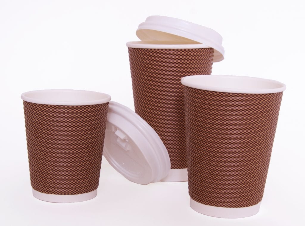
A perfect example of this and one that is guaranteed to set off your hot drinks on the right track in January is our very own Executive Paper Coffee Cups.
These use an eye-catching, trend-setting, two-tone grid design and ultra-firm ribbing which looks and feels great, even before you’ve tried the coffee!

Emboss, deboss, textured paper, textiles, whatever you choose, it’s bound to get bigger in the new year.

Check out our range of textured packaging.

Takeaway Packaging - Coffee Cups

Environmentally Focussed & Renewable Sources

Consumers and brands have become ever more environmentally conscious.

There is an increasing availability of renewable materials which also helps to promote their use. Those purchasing takeaway packaging can now get hold of more obscure materials such as wood fibres, shrimp shells, mushrooms or sugarcanes to replace harmful polymers.

Safe and responsible packaging is the go-to option for consumers who are concerned about the environment and who want to have greater control over their waste.

Of particular concern at the moment is the terrible issue of plastics in the ocean.

Last month, the Independent reported “around eight million tons of plastic makes its way into oceans each year, where it gets eaten by fish or birds. More than a million seabirds and 100,000 sea mammals die annually from getting caught in or swallowing the waste.”

To combat this the Chancellor is considering a tax on takeaway packaging with particular regard to single-use packaging. This follows the charge on plastic carrier bags.

Raising awareness is one thing but attacking the problem at its source is the only way that the problem will be resolved which is why the rise of zero-waste initiatives are driving the trend in eco-packaging.

Browse through our selection of green packaging options to consider how you can help.

compostable drinks cup

Minimalist Design

Our final trend spot which has entered onto the radar more recently is the minimalist approach to packaging design.

In many cases, we’ve seen a surge of packaging with ultra-minimal imagery or even the stripping away of graphic elements entirely.

Many brands are opting for a cleaner, ‘essentialist’ look which avoids noisiness and excessive information.

This theme is rife throughout the takeaway industry already and definitely looks set to stay as we’ve found that a number of brands want to customize just their labelling and leave the rest of the packaging plain, letting the material speak for itself.

Consider how you can adopt these trends into your packaging arsenal. A good brand and logo should cater for a versatile approach to packaging.

Get in touch for expert advice on choosing the right packaging styles to suit your company making 2018 your trendiest year yet!

7 Steps to Designing a Great Logo
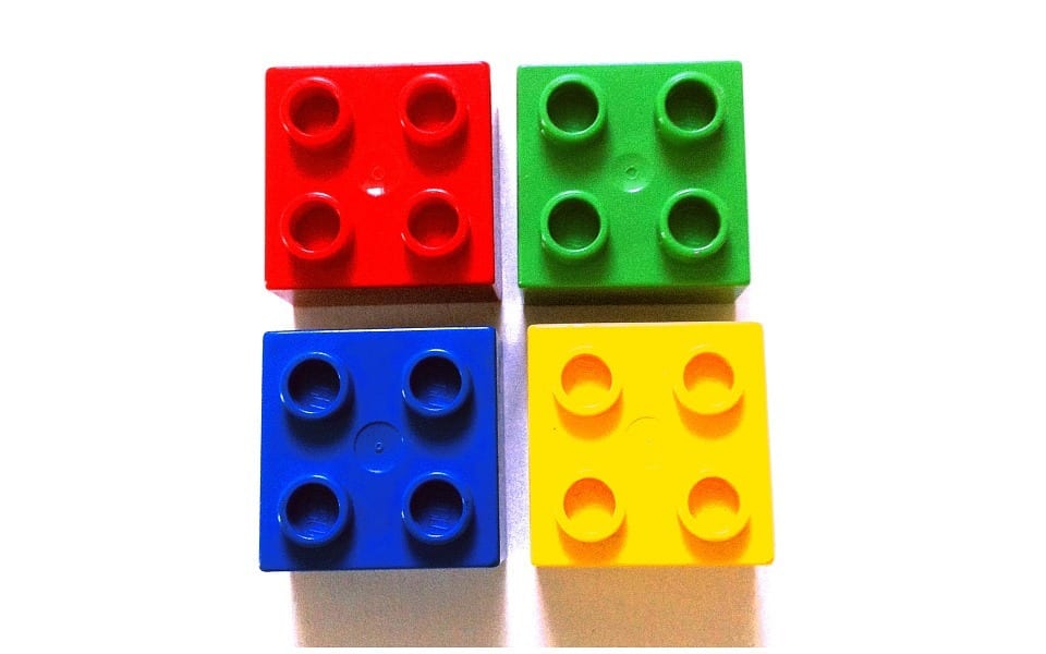
Duplo Windows Logo Lego

We can all recall the logos of great brands and successful companies, but what makes them so good?

What makes Apple’s logo so distinctive?

How is it that Starbucks don’t need to write their name on their coffee cups?

For many companies, their logo is simply an extension of their brand and their message, directly correlating to the product or service they provide. Think Burger King; their logo is essentially just a burger.

For others, there’s a charming story behind the design. Apple picked their logo because they felt that apple is a friendly fruit.
Think about other associations with apples, Snow White for example: much like Apple hardware, she is beautiful, pure and a lover of apples. (Note, this example works if you ignore the poison).

Apple Logo

Later, to make the logo unmistakably an apple and not say, a plum or a lemon, the ‘bite’ was added. Of course, this also allowed geeks take great pleasure in ‘byte’ puns.

So what about that strange-looking lady with the crown on Starbucks coffee cups?

This was actually conceived as a literary reference. Supposedly she was based on a Siren from Melville’s Moby-Dick and the name was taken from the Captain’s first mate, Starbuck.

There’s no doubt that although the Starbucks lady doesn’t scream ‘coffee’, its originality certainly makes it stand out from the crowd, not to mention the pleasing-green colouring. Instead, she screams ‘Starbucks’ (and possibly beautiful songs to lure sailors), and Starbucks screams coffee.

However a logo is initially conceived, it’s only through exploring the logos of brands such as Apple and Starbucks that we can learn from their success.

We have provided some lessons and important considerations which you can employ to make your logo more distinctive and appealing on takeaway packaging.

Starbucks Coffee Cup

Simple

Logos are used as a form of rapid identification. Keeping things simple will mean that your customers can identify with a particular brand in an instant.

Have a look at the Starbucks logo and consider how simple and low in detail it is without losing any impact or clarity.

Remember to avoid over-complication. Your logo should be as concise as your own verbal description of what your do, just like when you’re at a party or a networking event and someone asks you what you do. Keep it clean, clear and avoid fussiness.

Distinctive

Aim to stand out and be distinctive, set yourself apart from the crowd. What can you do to be a little different without losing the elements of your message?

For the same reasons as keeping your logo simple, rapid recognition of your brand is key and the success of your branding and marketing will be down to how quickly customers identify with your logo.

If your logo gets lost in busy visual environments, how might this affect your advertising?

Targeted

Don’t forget to continue asking yourself questions about the relevance of your logo. Is it relevant and to your industry?

Does it speak to your target audience? Lots of pastile colours and cartoon characters might suit a younger audience better than an older one.

Just don’t rush to use pound signs if you’re in a luxury market, subtlety ought to prevail sometimes!

Lamborghini-logo

Versatile

For versatility, consider the application of your logo.

Will your logo work in a video as well as it might printed on a letterhead? Will its impact be diluted by the use of different sizes or formats?
This isn’t necessarily a bad thing, but simplicity will serve you well here (again) and help to ensure that in the face of versatility, your logo’s message remains clear and consistent.

What if colour were to be removed from the equation, would that cause anything be lost? Or what if your logo were to be set against a dark background instead of a light one?

Speak to a graphic designer about drawing up your logo in a vector format, this will ensure that no detail or quality is lost upon resizing.

Appropriate

Making sure that your logo is appropriate to your business will ensure that it remains true to your brand and that the marketing you do is effective. Apple’s logo is simple and aesthetically pleasing which appropriately reflects the simplistic design and beauty of its products.

If your logo is too obscure it might detract from your brand message. If it’s too obvious it might seem unoriginal and blend in with other logos in your industry.

Another point worth thinking about is avoiding an over-reliance on a particular object or theme relating to your business. This is important in case you decide that further down the line you want to expand your service offering.

Memorable

How easily can your logo be recalled in someone’s mind? It doesn’t always require seeing something hundreds of times over in order to recall the picture in your mind. Again, think back to Starbucks, it’s easy to conjure the image of the pointed crown and long, flowing hair of the siren.

Because it’s so memorable, Starbucks don’t need to include their name on their coffee cups. The green lady is unmistakably Starbucks.

This certainly isn’t an easy thing to achieve but ensuring you follow the other tips will certainly help you on your way – think simplicity and target audience for this one.

Maybe a literary reference isn’t such a jump when you consider the number of people that read books in coffee shops…

Timeless

Beards and check shirts might not always be trendy.

The same is true for your logo. Try to incorporate a degree of timelessness. Consider how quickly things can change across 3 years and bear this in mind for your logo design.

Things to avoid here are on-trend typefaces and imagery.

Talk to us about how our bespoke branding and design service can help you to make the most of your company brand and logo.

Once you have the logo design it’s time to decide what you’re going to print it on and to show if off to the world.

3 Festive Soup Recipes to Keep Your Customers Warm
Soup for bespoke pots

Even though Winter doesn’t officially begin until late in December, it’s started to turn very cold and we’ve definitely been feeling the effects here at Takeaway Packaging HQ.

We’ve been thinking about the best way to keep warm while we prepare for a busy festive season.

One suggestion was that we could line ourselves in super-insulating Double Wall Paperboard. After all, it’s the same material we use for some of our bespoke, branded coffee cups and that certainly stays hot.

It wasn’t until lunchtime two days ago, when the hunger pangs kicked in, that the perfect solution to keeping warm became obvious to us…Soup.

We love eating soup. We love making soup. We love designing pots for soup.

Are your customers short on time but don’t want to miss a cosy café soup lunch?

Look no further.

Our custom soup pots solve the cosy-soup/working-lunch dilemma. There’s simply no need for your customers to eat in and fall behind on work when they can take your soup with them.

Bespoke designs mean you can maintain your branding presence, and snug, branded lids mean that your delicious soup travels safely and secure, from kettle to desk.

We’ve selected 3 of our favourite recipes for soup inspired by the festive season to tempt you and your customers.

Winter soup

Creamy Cauliflower and Bacon Soup

This soup is simple, creamy, smokey and comforting. Bacon and cauliflower pair so well together and this is sure to be a winner.

Check out this awesome recipe in full here

(Makes 4 servings, scale as necessary)

You will need:
8 rashers of bacon, cut into pieces
1 medium onion, finely chopped
6 spring onions, white and pale green parts only, thinly sliced
4 medium cloves of garlic, thinly sliced
1 litre of chicken stock
2 bay leaves
350ml of heavy cream
1 head cauliflower, cut into florets
Salt and freshly ground black pepper

1.. Heat bacon in a large heavy-based pan, stirring constantly until bacon is completely crisp. Remove from the pan with a slotted spoon and set aside, leaving the fat in the pan.

2. Add onions, half the spring onions and garlic. Cook and stir constantly, scraping browned bits from bottom of the pan until the onions have softened.

3. Add chicken stock, bay leaves, cream and cauliflower then season to taste with salt and pepper. Cover and cook until cauliflower is tender.

4. Using a stick blender (or equivalent), blend soup until completely smooth (may need to be done in batches).

5. Strain if extra-smooth is desired. Stir in a little more hot chicken stock if too thick.

6. Season with salt and pepper and serve with sprinkled crispy bacon pieces and the remaining spring onions.

‘Mmmm bacon’

Spiced Butternut Squash Soup

This soup is perfect for curing wintery chills. It’s spicy, a bit different and contains a glug of Santa’s favourite drink.

Check out LuvMyFamily recipe for more details

(Makes 8 servings, scale as necessary)

You will need:
1.5kg of butternut squash, peeled and seeded
50g butter
1 medium onion
1 leek, sliced
2 cloves garlic, sliced
1 litre of chicken stock
2 large potatoes
1/8 tsp cayenne pepper
1/8 tsp ground allspice
1/8 tsp ground nutmeg
1/8 tsp ground ginger
Salt and freshly ground pepper
125ml sherry
125ml double cream
125ml milk
125ml soured cream (optional garnish)

1.. Preheat oven to 190 C. Pour small layer of water into a baking dish. Place the squash halves cut-side-down on the dish.

2. Bake for around 40 mins or until a fork can easily pierce the flesh. Allow to cool slightly, then remove the peel and set aside.

3. Melt the butter in a large pot over medium heat. Add the onion, leek and garlic and sauté for a few minutes until tender.

4. Pour the chicken stock into the pot. Add the potatoes and bring to the boil. Cook for about 20 mins or until soft.
Add the squash and mash with the potatoes until the chunks are small. Use a stick blender to purée the soup until smooth (a food processor used in batches would also work).

5. Season the soup with the cayenne pepper, allspice, nutmeg, ginger, salt and pepper. Stir in the sherry, cream and milk. Heat through, but do not boil.

6. After serving, top with a dollop of soured cream, and smile.

Mulligatawny Soup

Our final choice is a bold one. Similarly to number 2, it’s full of warming spices and wintery veg. This heritage-rich dish harks back to the British Raj and is steeped in history as much as it is peppery, curried-beef stock.
This is a soup for park benches in the winter and watching the world go by.

Credit to Waitrose for their fantastic recipe.

(Makes 4 servings, scale as necessary)

You will need:
2 tbsp olive oil
1 onion, finely chopped
250g minced beef
2 carrots, cut into 1cm cubes
300g butternut squash, cut into 1cm cubes
1 large red chilli, finely chopped
5cm piece ginger, finely chopped
1 tbsp Marsala curry paste
400g chopped tomatoes
1 litre beef stock
1 tbsp mango chutney
100g basmati rice
Handful fresh coriander, chopped

1.. Heat the olive oil in a large pan, and cook the onion for 4-5 minutes until beginning to soften. Add the minced beef, and cook with the onion until it is browned all over, breaking up with a wooden spoon as you go.

2. Stir in the carrots and butternut squash, and toss together with the mince and onions cooking for just a few minutes, then stir in the chilli and ginger, and cook for a further minute.

3. Add the curry paste and chopped tomatoes, and mix, then add the stock and mango chutney. Simmer for 25 minutes until the vegetables are tender.

4. Meanwhile, place the rice in a small saucepan and cover with cold water about 3cm above the level rice. Bring to the boil and simmer until all the water has been absorbed by the rice.

5. Remove from the heat, cover and leave to sit while the soup is cooking.

6. Stir the rice into the soup along with the chopped coriander. Then serve with a dollop of greek yoghurt.

There you have it, 3 soups we are sure will help you and your customers to survive the cold and start feeling festive.

Not as obsessed with soup as we are? Try filling our pots with a hearty winter stew or start the day right with porridge sprinkled with cinnamon and sugar.

Talk to us about designing your own soup cups, we can brand the lids too.


Loud & Proud: 5 ways your branding can generate leads organically
Branded Proud

The power of product branding can completely transform the marketing efforts of a business. For many businesses the packaging of products is as  important as the product itself. Sometimes it’s the first opportunity to communicate to a customer. The most successful businesses use branded packaging to promote a lifestyle or create an emotional connection with a product.

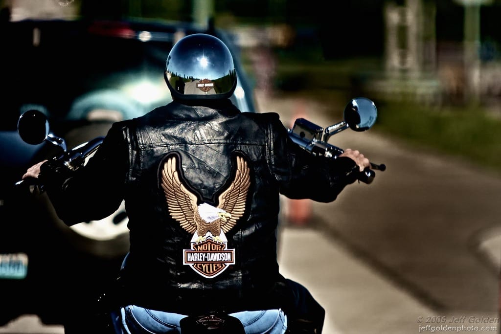
One such company that has nailed this is Harley Davidson, who need little introduction. It could be argued that there is nothing louder than a Harley Davidson motorbike and nothing prouder than someone riding one.

Now, you’re probably thinking that the Harley brand must be the product of a very costly marketing team and highly expensive media campaign over a number of years?

Think again. It is true that the company is over 100 years old, but that hasn’t been without its bumps in the road, namely its association with terrifying biker gangs. In reality, for the last 4 years running, Harley Davidson has spent just 15% of its marketing budget on traditional media.

Harley Davidson

Identify your audience

Here’s the thing, Harley Davidson isn’t selling motorbikes, they’re selling a lifestyle, an emotional attachment to the freeing and liberating experience of an open road. That’s what they’re marketing to. Bike sales are the byproduct.

John Russell, former MD of Harley Davidson Europe, once said:

“Harley Davidson sells to 43-year-old accountants the ability to dress in leather, ride through small towns and have people be afraid of them.”

No mention of engines, brakes, or steering. This is the emotional connection that the company nurtures. The very idea of Harley Davidson, its riders and community transcends way beyond the concept of an automotive manufacturer.

It’s important to recognise who are your customers and ask yourself who you are marketing to? Know their identity and embrace it, represent them and define them through your brand and your packaging.

Make your mark

Once you’ve identified your customer, you can focus your efforts on being noticed. Harley riders know that you don’t just ride a Harley Davidson, you need to dress the part as well, and naturally, only Harley leathers would do. You don’t need to own or even ride a bike to wear a jacket, fashion is open to anyone.

In this way, the brand became iconic.

Consumers form a community and loyalty soon follows. Harley riders embrace the culture as their way of life with wearers of their clothes turning into brand-advocates. How many companies can claim as many branded tattoos as Harley Davidson? If you make your mark, so will your customers.

Find a stage

A captive audience is great. A loyal following is even better. A passionate fan-base who spread their experiences by word-of- mouth, is the pinnacle of brand strength. In order to get to this stage your followers need to have a platform from which to shout to the masses and sing your praises. Harley Davidson recognised this and wanted to channel all the adulation and enjoyment of the Harley lifestyle. In doing so they created the Harley Owners Group (H.O.G.), connecting customers and expanding the network.

In order to fuel the effects of the platform and inspire greater loyalty, the H.O.G. is free to join for the first year and members are offered special promotions.

Harley Davidson

What’s left is a vehicle for organic brand promotion arrived at through treating their customers as family who participate in the production and promotion of the brand. Effectively, they are walking and talking billboards.

Crowd-source your ideas

Harley Davidson has built such a strong following and trusts their fan-base so much so that they invite their customers to share and create their own stories via a “Fan Machine” app on the company’s Facebook page. This is how they source their creative ideas, and by doing so, they have eradicated the need for a lead agency. What’s more, the customers couldn’t be happier that they can engage with the brand on such a direct and personal level.

Harley does use agencies for media and digital projects, but continues to rely on customers for creative ad ideas. As a result the company actually invests less than a million dollars on advertising each year.

Invest in your marketing

Harley Davidson realised that if they focus on their brand and their customers then new business leads would be generated organically. They would also be high quality and founded on a taste for kinsmanship, community, and becoming a feared 43-year- old accountant.

It’s all about understanding the full value of a lifetime customer. Imagine you run a business where the lifetime customer value is £15,000 then you could buy a lead for £4,500.

The cost of the lead might seem high, but you still make lots of money. That’s the mentality of marketing as an investment, not an expense. Teaching yourself to make this shift will help you to evaluate the high return that your investment could achieve.

Remember, the Harley Owners Group is free to join for the first year, so consider the cost of running this self-sustaining network against the potential revenue in motorbike sales. Consider also the cost of producing Harley Davidson leather jackets and associated apparel – a sellable product and a marketing tool.

Get in touch today to find out how could you invest in your marketing to make your brand and packaging work harder for you, for less.

Want to invest in your brand’s packaging? Contact us today for friendly and expert advice.

How to Brand Your Own Food Packaging Online
Takeaway Packaging

At Takeaway Packaging, we know that branding your products promotes your business and gives continuity to brand identity.
We wanted to make it as easy as possible for you to brand your takeaway & street food packaging, which is why we introduced the ‘Fancy Product Designer’.

What is the Fancy Product Designer?
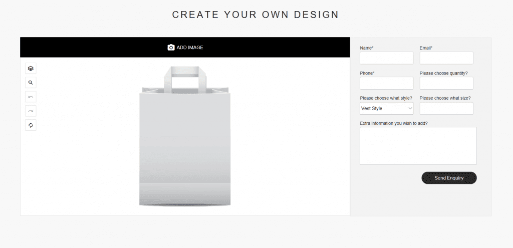
The Fancy Product Designer features on all of our product pages. It enables users to brand their own packaging on screen & send it along to us for quoting. We’ve also added an additional enquiry form, here you can add your sizes, styles, quantities, your contact details and any further information you want us to know.

How to use
To use the product designer effectively, begin by selecting the images you wish to incorporate on your food packaging. As with most things, higher quality images will produce better looking products*.
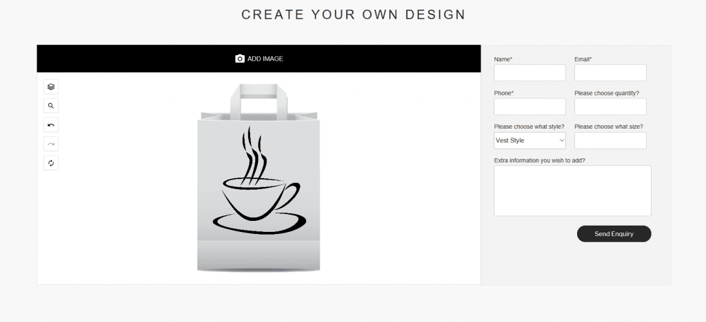
Once you’re happy with your chosen images, select add image & follow the instructions shown. Images you have uploaded can be accessed in ‘add image’ at any time.

Takeaway Packaging | Create your own packaging
Fancy Product Designer

Next, decide on positioning and size. You can easily drag and drop elements to suit your desired look.

Takeaway Packaging
Fancy Product Designer

The final step is filling out the enquiry form and pushing send. This is where you will choose the size style and quantity. It is also beneficial to add the colours you require – including the colour of the packaging. It really is that simple.

If you’ve got your artwork & logos, but aren’t the best at design, send it along and we can help you out. Just leave us a comment and we’ll get our in-house design team straight on it. All food packaging is uniquely designed with your brand values and guidelines in mind. If you don’t see the product you’re looking for, get in touch with us – we’re positive we can help.

TIP!
For the best results, use PNG images or other files without backgrounds. This will create the most realistic and true to life appearance. please Ensure your images aren’t too large. This won’t hinder the process, but it will take you a while to shrink it down.

*Please note: this is purely for quoting purposes, the final artwork will be transferred onto a cutter guide prior to printing.


Increasing Brand Awareness with Printed Paper Cups
Double Wall Coffee Cup
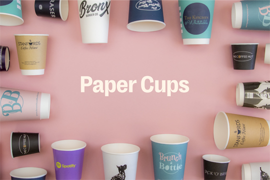
Printed paper cups are probably one of the best and most visible ways to market and reinforce a brand.

Printed Paper Cups
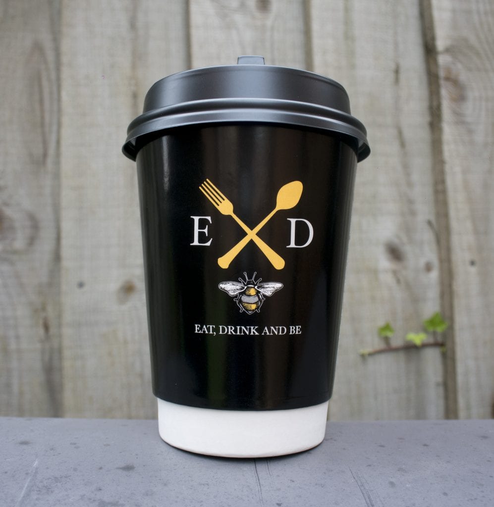
Eat, Drink And Be Printed Paper Cup

Whilst the catering and food industry makes up the majority of market users, Takeaway Packaging are finding that other business sectors, such as car dealerships, tourist attractions and even banks are looking toward  printed paper cups as a method of brand endorsement.

Printed coffee cups are a cost effective marketing tool and are a fraction of the cost of other branded promotional merchandise. Minimum order quantities are as low as 1000 units, meaning that they are also a very accessible and affordable for the smaller user.

Sleeves are another application that can be branded and use in conjunction with unbranded paper cups, allowing businesses to have a range of advertising or promotions to suit their needs.

Get in touch with us for further information and prices.
Customisable, Collectable & Crazy Curly Straws!
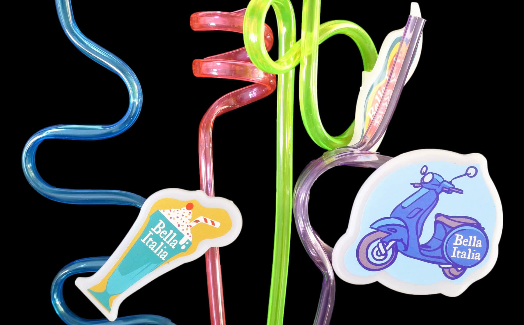
Bella Italia Curly Straws
Takeaway Packaging produce and supply a large range of drinking straws, from stock or branded to your specific requirements. Curly Straws are just one of these.

Bella Italia’s Curly Straws
We created a clip-on accessory that could be added to curly straws which allows them to be branded with characters or company logos. Many our customers have now adopted this idea and have found that kids like to collect the whole set of colours and clip on accessories.
‘The children love the straws, they always take them home – we have even had adults asking for them!’

Restaurant Manager – Bella Italia, Taplow.

Did you know…

There have been a number of new developments in straw technology since the days of waxed lined paper, which eventually became soggy and no longer usable. With improved plastic blends constantly evaluated, this being vital to keep costs down, meet regulations and improve quality.

Manufacturing and design methods are always being developed, for instance thermoliquid crystals, a specialised colourant that reacts to changes in temperature can be added to straws to make them change colour when they come in contact with hot or cold liquids. Blow molding is another process which can create names or shapes in the middle of the straw.

Takeaway Packaging offer many unique applications including ways of printing or branding straws which can be used as a promotional tool or even identify the type of beverage being served.

Visit our biodegradable straws page for more information, or feel free to get in touch with us.