


We can all recall the logos of great brands and successful companies, but what makes them so good?
What makes Apple’s logo so distinctive?
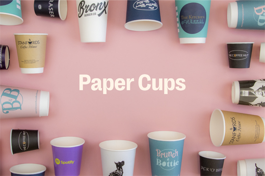
How is it that Starbucks don’t need to write their name on their coffee cups?
For many companies, their logo is simply an extension of their brand and their message, directly correlating to the product or service they provide. Think Burger King; their logo is essentially just a burger.
For others, there’s a charming story behind the design. Apple picked their logo because they felt that apple is a friendly fruit.
Think about other associations with apples, Snow White for example: much like Apple hardware, she is beautiful, pure and a lover of apples. (Note, this example works if you ignore the poison).
Later, to make the logo unmistakably an apple and not say, a plum or a lemon, the ‘bite’ was added. Of course, this also allowed geeks take great pleasure in ‘byte’ puns.
So what about that strange-looking lady with the crown on Starbucks coffee cups?
This was actually conceived as a literary reference. Supposedly she was based on a Siren from Melville’s Moby-Dick and the name was taken from the Captain’s first mate, Starbuck.
There’s no doubt that although the Starbucks lady doesn’t scream ‘coffee’, its originality certainly makes it stand out from the crowd, not to mention the pleasing-green colouring. Instead, she screams ‘Starbucks’ (and possibly beautiful songs to lure sailors), and Starbucks screams coffee.
However a logo is initially conceived, it’s only through exploring the logos of brands such as Apple and Starbucks that we can learn from their success.
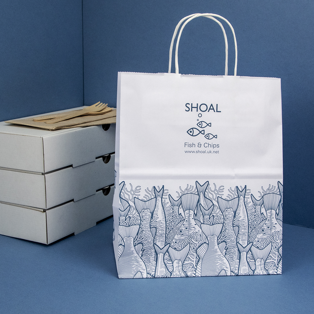
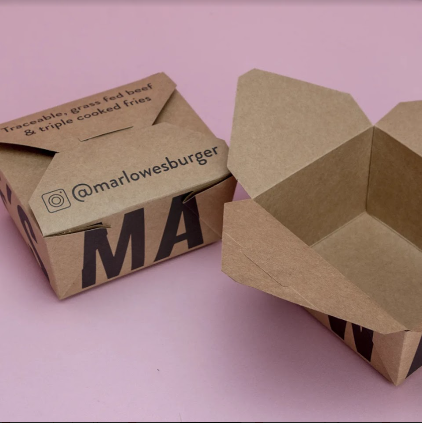
We have provided some lessons and important considerations which you can employ to make your logo more distinctive and appealing on takeaway packaging.

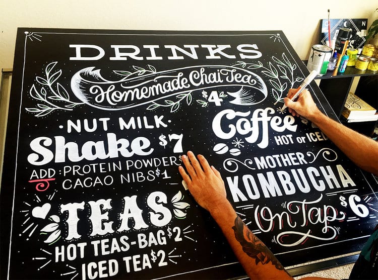
Simple
Logos are used as a form of rapid identification. Keeping things simple will mean that your customers can identify with a particular brand in an instant.
Have a look at the Starbucks logo and consider how simple and low in detail it is without losing any impact or clarity.
Remember to avoid over-complication. Your logo should be as concise as your own verbal description of what your do, just like when you’re at a party or a networking event and someone asks you what you do. Keep it clean, clear and avoid fussiness.
Distinctive
Aim to stand out and be distinctive, set yourself apart from the crowd. What can you do to be a little different without losing the elements of your message?
For the same reasons as keeping your logo simple, rapid recognition of your brand is key and the success of your branding and marketing will be down to how quickly customers identify with your logo.
If your logo gets lost in busy visual environments, how might this affect your advertising?
Targeted
Don’t forget to continue asking yourself questions about the relevance of your logo. Is it relevant and to your industry?
Does it speak to your target audience? Lots of pastile colours and cartoon characters might suit a younger audience better than an older one.
Just don’t rush to use pound signs if you’re in a luxury market, subtlety ought to prevail sometimes!
Versatile
For versatility, consider the application of your logo.
Will your logo work in a video as well as it might printed on a letterhead? Will its impact be diluted by the use of different sizes or formats?
This isn’t necessarily a bad thing, but simplicity will serve you well here (again) and help to ensure that in the face of versatility, your logo’s message remains clear and consistent.
What if colour were to be removed from the equation, would that cause anything be lost? Or what if your logo were to be set against a dark background instead of a light one?
Speak to a graphic designer about drawing up your logo in a vector format, this will ensure that no detail or quality is lost upon resizing.
Appropriate
Making sure that your logo is appropriate to your business will ensure that it remains true to your brand and that the marketing you do is effective. Apple’s logo is simple and aesthetically pleasing which appropriately reflects the simplistic design and beauty of its products.
If your logo is too obscure it might detract from your brand message. If it’s too obvious it might seem unoriginal and blend in with other logos in your industry.
Another point worth thinking about is avoiding an over-reliance on a particular object or theme relating to your business. This is important in case you decide that further down the line you want to expand your service offering.
Memorable
How easily can your logo be recalled in someone’s mind? It doesn’t always require seeing something hundreds of times over in order to recall the picture in your mind. Again, think back to Starbucks, it’s easy to conjure the image of the pointed crown and long, flowing hair of the siren.
Because it’s so memorable, Starbucks don’t need to include their name on their coffee cups. The green lady is unmistakably Starbucks.
This certainly isn’t an easy thing to achieve but ensuring you follow the other tips will certainly help you on your way – think simplicity and target audience for this one.
Maybe a literary reference isn’t such a jump when you consider the number of people that read books in coffee shops…
Timeless
Beards and check shirts might not always be trendy.
The same is true for your logo. Try to incorporate a degree of timelessness. Consider how quickly things can change across 3 years and bear this in mind for your logo design.
Things to avoid here are on-trend typefaces and imagery.
Talk to us about how our bespoke branding and design service can help you to make the most of your company brand and logo.
Once you have the logo design it’s time to decide what you’re going to print it on and to show if off to the world.