How to Design Packaging for a Subscription Service
subscription service design

Something which comes up an awful lot in the packaging channels of this world, is how best to design packaging suited to a subscription service.

Given our love of all things design and packaging, we thought we’d share some core tips on the sorts of things you need to consider about your packaging designs.

Using the example of a box, this will range from the dimensions of the box to the type of box used.

We follow with some pointers around graphic design and also cover the often overlooked aspect of enhanced advertising.

Many businesses will tell you that it’s often very easy to get carried away with the design elements of a new packaging idea.

While it’s fundamental to the success of a brand’s image and perception, it’s not all about design – choosing the right style and size of the box can hugely impact your profitability.

Subscription service gift

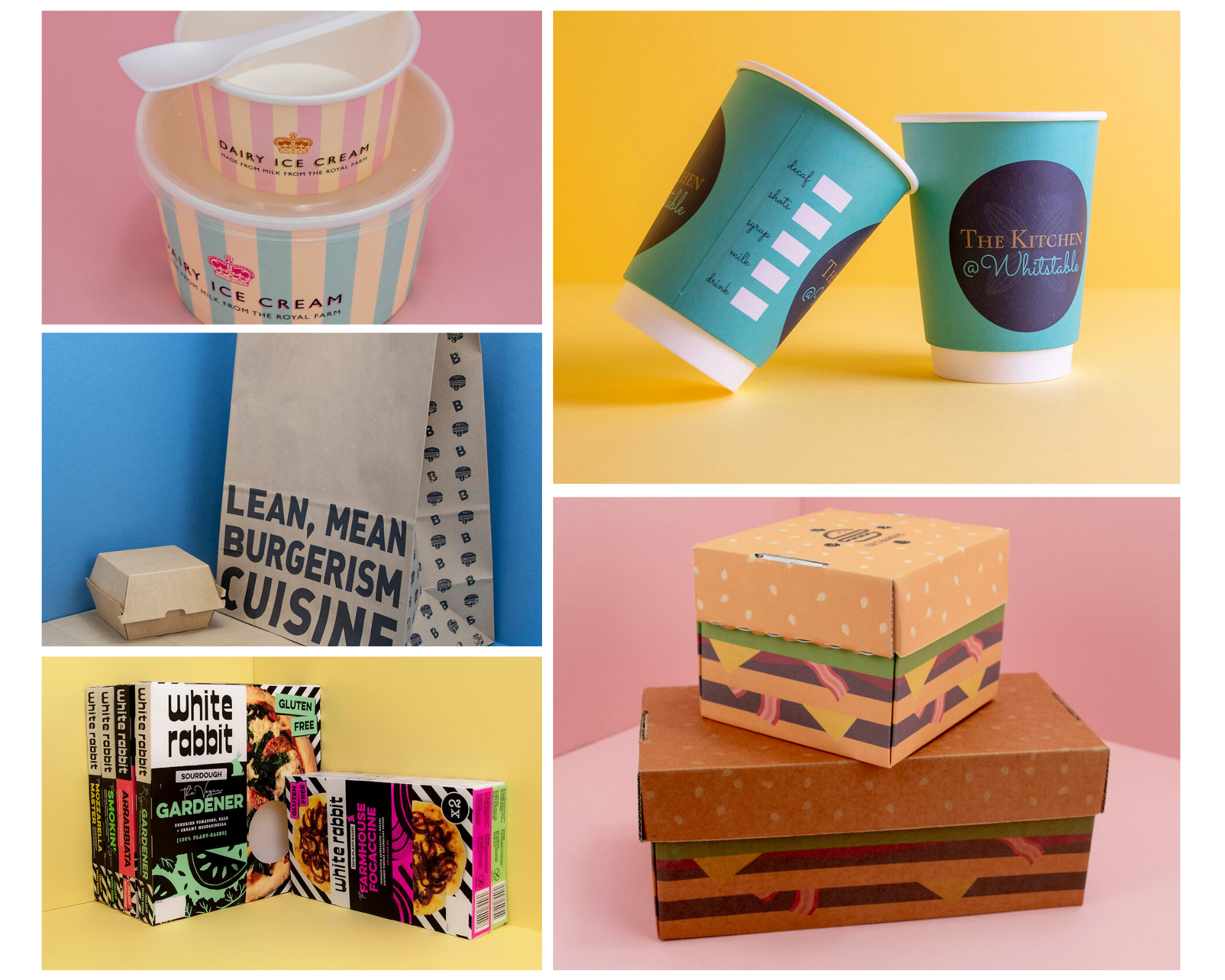
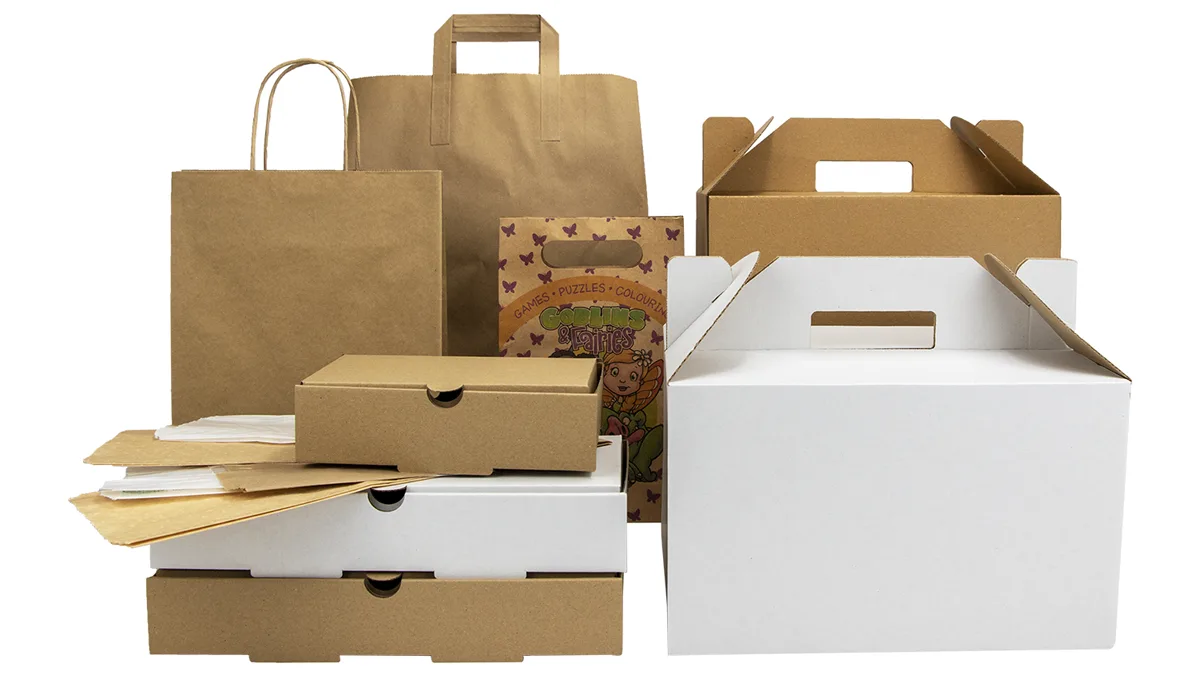
Size Matters – Think Inside The Box

Make sure you’re clear on exactly what will be going in the box or packaging each time you send it and try to use as small a box as possible.

This will help you in a number of ways:

Lower costs on manufacturing and materials (namely cardboard).

A smaller box, and subsequently a reduction in the weight of the box, leaves more allowance for weight of the items themselves, resulting in lower overall shipping costs.

Client retention: customers will perceive the contents to be of greater value – the smaller the box, the fuller it seems

Whereas, if your box is too big and there’s too much space for your products, it will seem underfilled.

In cases where you need to send larger packaging to accommodate an anomaly item, go for two!

Even with two on the odd occasion, you’ll find that you still achieve a saving on your shipping costs – 11 months smaller box and 1 month two boxes.
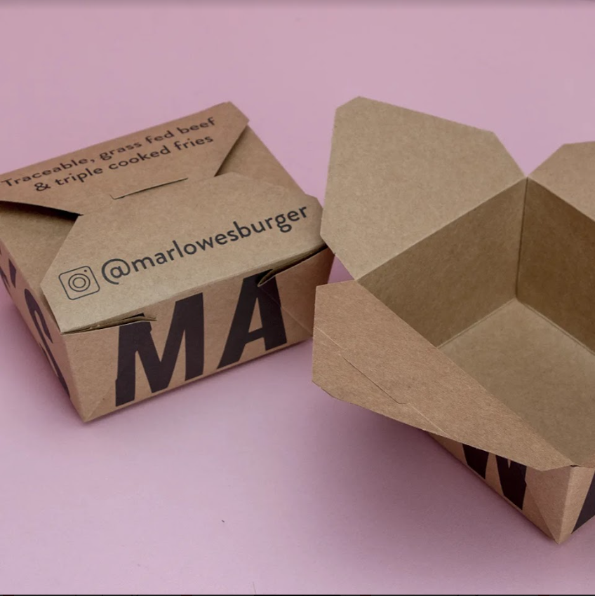
subscription service items

What’s Your Style?

There are a lot of factors to consider here:

Is your box suitable to ship as it is, or will you need a secondary box to ship it in?

What about the style?

Keep in mind your budget here: 2-piece trays tend to give an impression of higher quality but this might mean you need to use a secondary shipping box – increasing your shipping costs.

On the other hand, tuck-fold closures are great for rapid production. You can cut down on labour and packing time by packing in advance.

One great tip is to use the shipping label as the securing tape.

Holding on to the pennies? Then the classic stock box aka one-piece folder cut-out might be the right option for you.

However, if you want a custom, non-stock shape then you may find you need to purchase the box-shape-cutter itself, once you’ve had it made.

Office subscription service

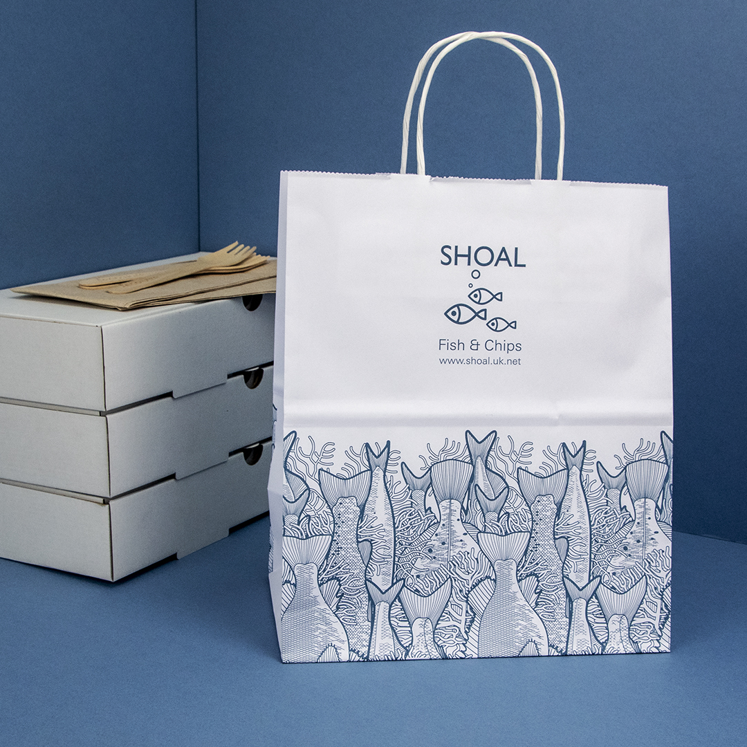
Think Outside The Box

The best way to think of your box is as a piece of directly mailed advertising with a 100% engagement rate!

It’s like sending an email you know is going to be opened.

This is your opportunity to sell through your packaging.

It’s completely up to you what elements you include, whether calls to action, offers or incentives.

Think social media sharing prompts, upsell offers or refer a friend options as great ways to increase sales.

Whatever it is, remember to test and measure.

subscription service design

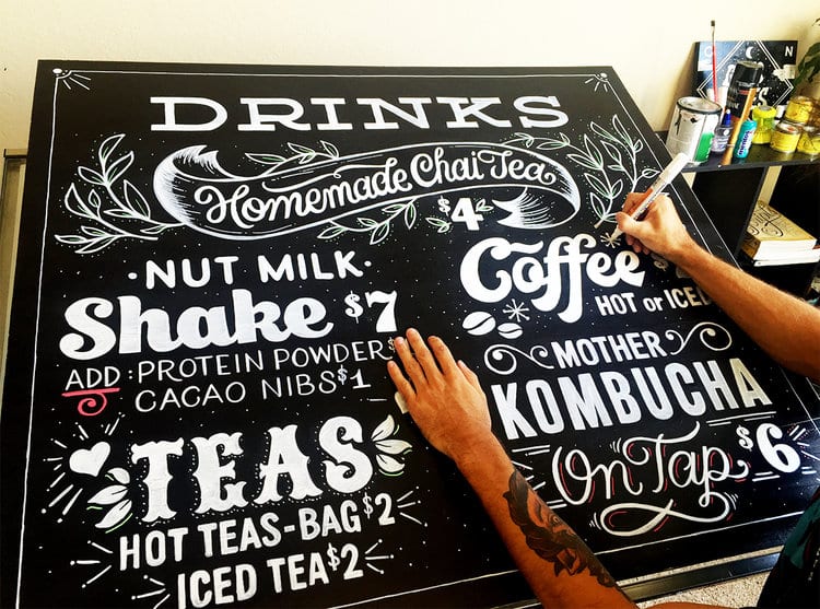
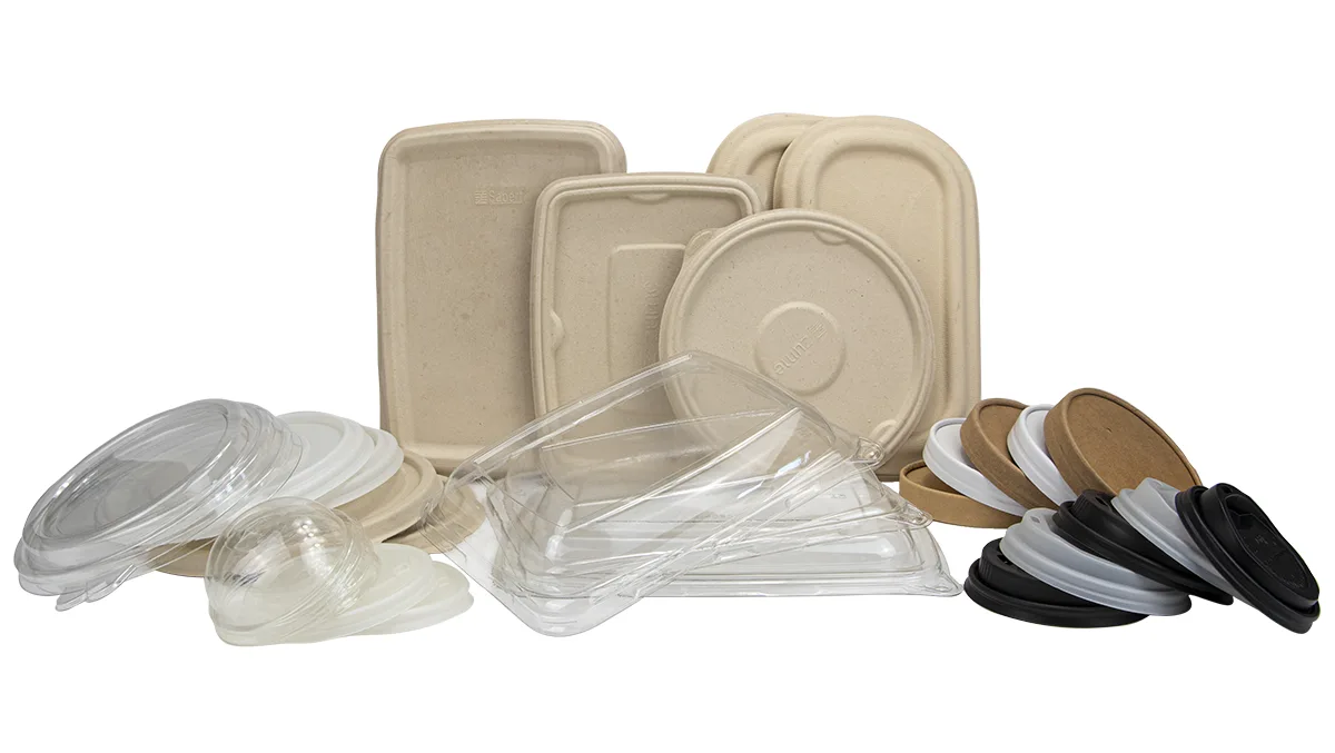
Graphic design & Artwork

Creating your own artwork is extremely rewarding but equally time consuming and difficult to do if you want a really professional finish.

If you don’t have an in-house graphic designer, then don’t despair!

We have a team dedicated to designing and producing fully bespoke, personal designs that are the perfect representation of your brand.

Generally speaking, on the graphic design and printing front, the more varied and full of colour your design, the more it’ll cost to print.

Using laminate coverings can create a very clean cut finish suited to more premium-styled packages.

Stay aware of the different features, forms and styles as these will either hurt or boost your bottom line in different ways!

Subscription service art design

Partner Up!

At Takeaway Packaging we provide a completely custom packaging service to suit any brand.

With our packaging and design expertise alongside our legendary joke-telling and enviable good looks, we make the perfect partner for your subscription packaging service.

To find out much more about the options available, drop us a line and let’s chat!

7 Steps to Designing a Great Logo
Duplo Windows Logo Lego

We can all recall the logos of great brands and successful companies, but what makes them so good?

What makes Apple’s logo so distinctive?

How is it that Starbucks don’t need to write their name on their coffee cups?

For many companies, their logo is simply an extension of their brand and their message, directly correlating to the product or service they provide. Think Burger King; their logo is essentially just a burger.

For others, there’s a charming story behind the design. Apple picked their logo because they felt that apple is a friendly fruit.
Think about other associations with apples, Snow White for example: much like Apple hardware, she is beautiful, pure and a lover of apples. (Note, this example works if you ignore the poison).

Apple Logo

Later, to make the logo unmistakably an apple and not say, a plum or a lemon, the ‘bite’ was added. Of course, this also allowed geeks take great pleasure in ‘byte’ puns.

So what about that strange-looking lady with the crown on Starbucks coffee cups?

This was actually conceived as a literary reference. Supposedly she was based on a Siren from Melville’s Moby-Dick and the name was taken from the Captain’s first mate, Starbuck.

There’s no doubt that although the Starbucks lady doesn’t scream ‘coffee’, its originality certainly makes it stand out from the crowd, not to mention the pleasing-green colouring. Instead, she screams ‘Starbucks’ (and possibly beautiful songs to lure sailors), and Starbucks screams coffee.

However a logo is initially conceived, it’s only through exploring the logos of brands such as Apple and Starbucks that we can learn from their success.

We have provided some lessons and important considerations which you can employ to make your logo more distinctive and appealing on takeaway packaging.

Starbucks Coffee Cup

Simple

Logos are used as a form of rapid identification. Keeping things simple will mean that your customers can identify with a particular brand in an instant.

Have a look at the Starbucks logo and consider how simple and low in detail it is without losing any impact or clarity.

Remember to avoid over-complication. Your logo should be as concise as your own verbal description of what your do, just like when you’re at a party or a networking event and someone asks you what you do. Keep it clean, clear and avoid fussiness.

Distinctive

Aim to stand out and be distinctive, set yourself apart from the crowd. What can you do to be a little different without losing the elements of your message?

For the same reasons as keeping your logo simple, rapid recognition of your brand is key and the success of your branding and marketing will be down to how quickly customers identify with your logo.

If your logo gets lost in busy visual environments, how might this affect your advertising?

Targeted

Don’t forget to continue asking yourself questions about the relevance of your logo. Is it relevant and to your industry?

Does it speak to your target audience? Lots of pastile colours and cartoon characters might suit a younger audience better than an older one.

Just don’t rush to use pound signs if you’re in a luxury market, subtlety ought to prevail sometimes!

Lamborghini-logo

Versatile

For versatility, consider the application of your logo.

Will your logo work in a video as well as it might printed on a letterhead? Will its impact be diluted by the use of different sizes or formats?
This isn’t necessarily a bad thing, but simplicity will serve you well here (again) and help to ensure that in the face of versatility, your logo’s message remains clear and consistent.

What if colour were to be removed from the equation, would that cause anything be lost? Or what if your logo were to be set against a dark background instead of a light one?

Speak to a graphic designer about drawing up your logo in a vector format, this will ensure that no detail or quality is lost upon resizing.

Appropriate

Making sure that your logo is appropriate to your business will ensure that it remains true to your brand and that the marketing you do is effective. Apple’s logo is simple and aesthetically pleasing which appropriately reflects the simplistic design and beauty of its products.

If your logo is too obscure it might detract from your brand message. If it’s too obvious it might seem unoriginal and blend in with other logos in your industry.

Another point worth thinking about is avoiding an over-reliance on a particular object or theme relating to your business. This is important in case you decide that further down the line you want to expand your service offering.

Memorable

How easily can your logo be recalled in someone’s mind? It doesn’t always require seeing something hundreds of times over in order to recall the picture in your mind. Again, think back to Starbucks, it’s easy to conjure the image of the pointed crown and long, flowing hair of the siren.

Because it’s so memorable, Starbucks don’t need to include their name on their coffee cups. The green lady is unmistakably Starbucks.

This certainly isn’t an easy thing to achieve but ensuring you follow the other tips will certainly help you on your way – think simplicity and target audience for this one.

Maybe a literary reference isn’t such a jump when you consider the number of people that read books in coffee shops…

Timeless

Beards and check shirts might not always be trendy.

The same is true for your logo. Try to incorporate a degree of timelessness. Consider how quickly things can change across 3 years and bear this in mind for your logo design.

Things to avoid here are on-trend typefaces and imagery.

Talk to us about how our bespoke branding and design service can help you to make the most of your company brand and logo.

Once you have the logo design it’s time to decide what you’re going to print it on and to show if off to the world.