


The Starbucks logo is a globally recognised icon and one which surrounds the household name.
A familiar face to crowded high streets with a calming-green background, it’s undeniable that Starbucks coffee cups stand out from the crowd… or is it?
Is it really fair to say that a plain white cup with a green logo jumps out of any picture or view and meets your eye instantly?
Probably not.
What is true, is that when you do see that green logo with the siren/maiden/lady thing, it’s unmistakably ‘Starbucks’.
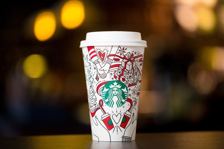
Last December, and piloted initially in the US, Starbucks launched a packaging campaign so great they gained the highest number of video views that season for their campaign advert:
Over 76 million views in under 1.5 months!
They beat all other brands across the whole period of Thanksgiving through to New Year 2018!
How?
They made their already iconic cup unusual and exciting.
Starting with an initial concept for the design of the holiday-season coffee cup, the cup featured seasonal, warming outlines of images of Christmas and merriment; wrapped presents, snowflakes and coca, all nestled around the Starbucks logo.

Their short video, below, simply explained that you can “make the holiday your own” then featured the newly designed cup changing colours – you design your own!
The cups in the advert feature all different colour schemes, vibrant and bold.
Even if the cups were coloured in terribly, they would be an object of humour and still likely standout.
Artists and within-the-lines-perfectionists would have really gone for it, only for the cup to then serve as a work of art and, you guessed it, free, ‘boosted’ advertising for Starbucks!
The campaign ticked all the boxes for the consumer; interaction and engagement with the product/brand, something different, something exciting (adults get to be big kids), and most of all, something personal.
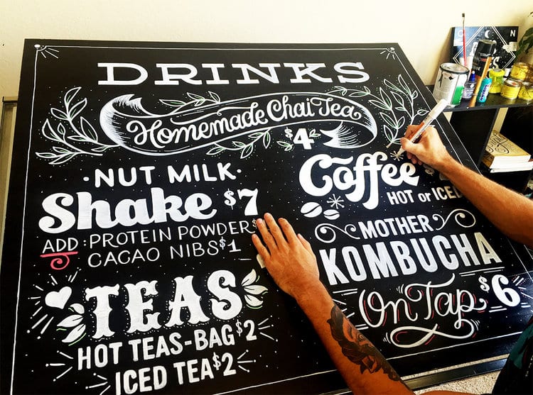
Top Tips For Standout Packaging
As with Starbucks, doing something different to other people similar to you, will go a long way towards making you standout.
Though no longer trading, Californian-based bakers The Crazy Good Bread Co, are an example of a company whose packaging stood out because it was unusual:

Doing something slightly ‘against the grain’ will help you to get your packaging noticed, and that includes packaging your bread in a weird card holder thing.
Staying ahead of the curve is another way for your packaging to to stand out.
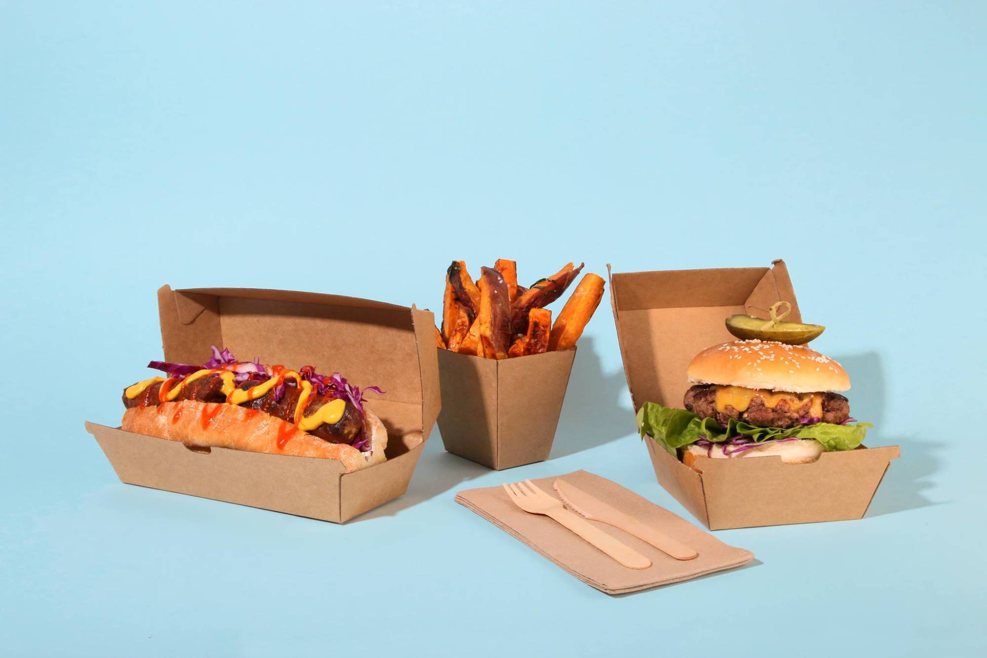
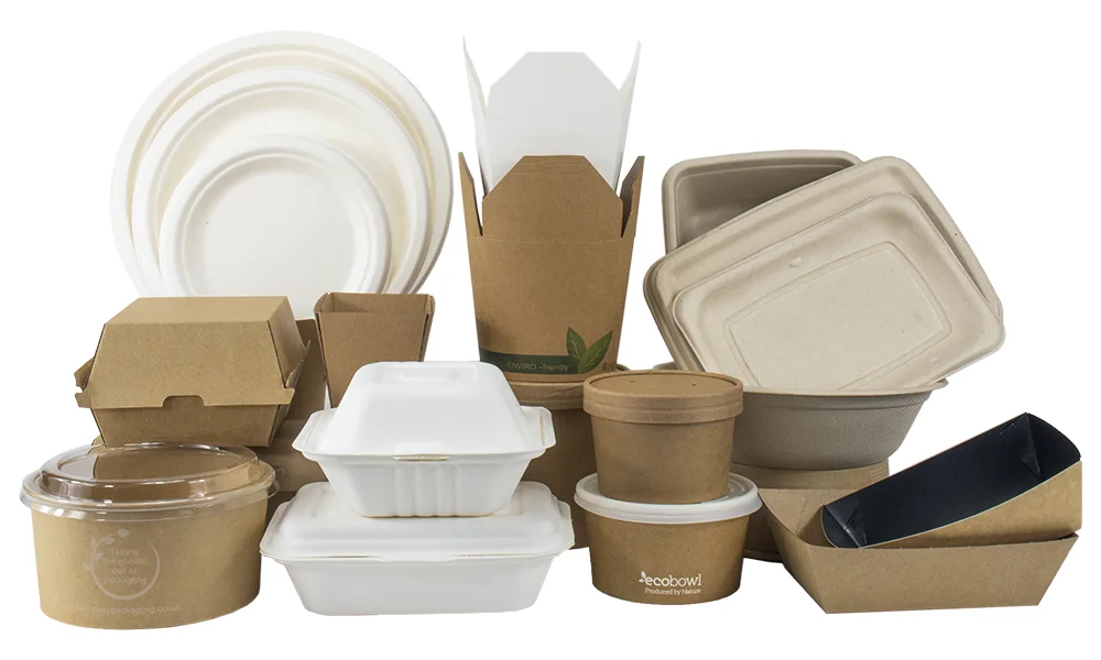
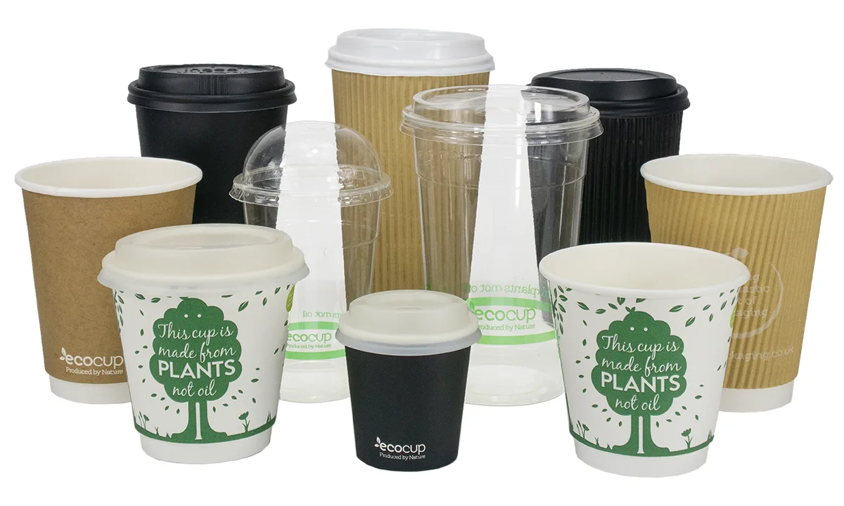
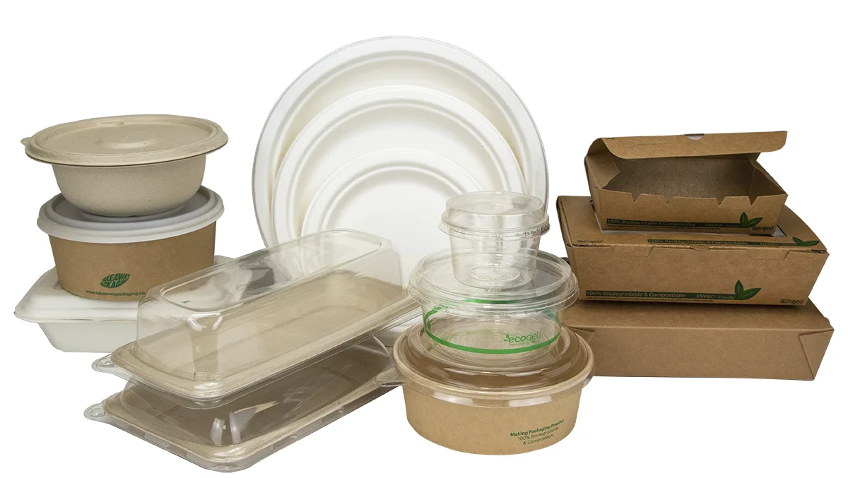
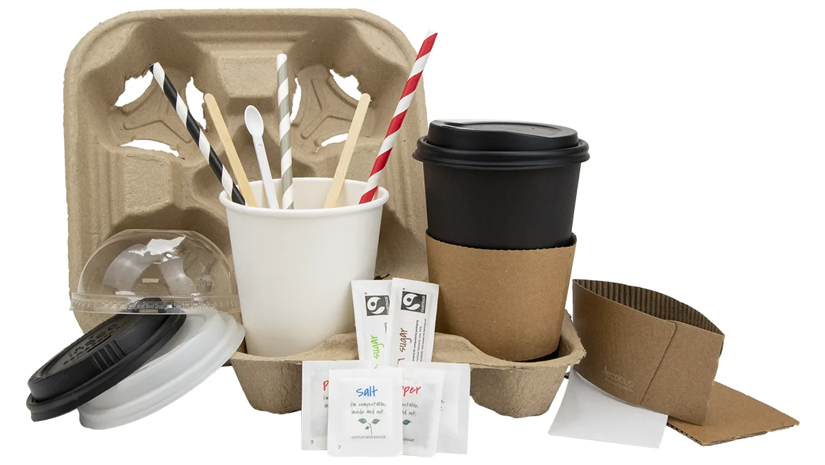
At a time when environmental concerns have never been higher, ensuring that you fully embrace the green/eco-friendly approach to waste and packaging will serve you really well.
Given that there are many, many businesses yet to do so, you will establish your brand as a conscious and progressive company that listens to its customers and considers carefully its own ethos and attitudes – this is a powerful consideration that certainly doesn’t go unnoticed.
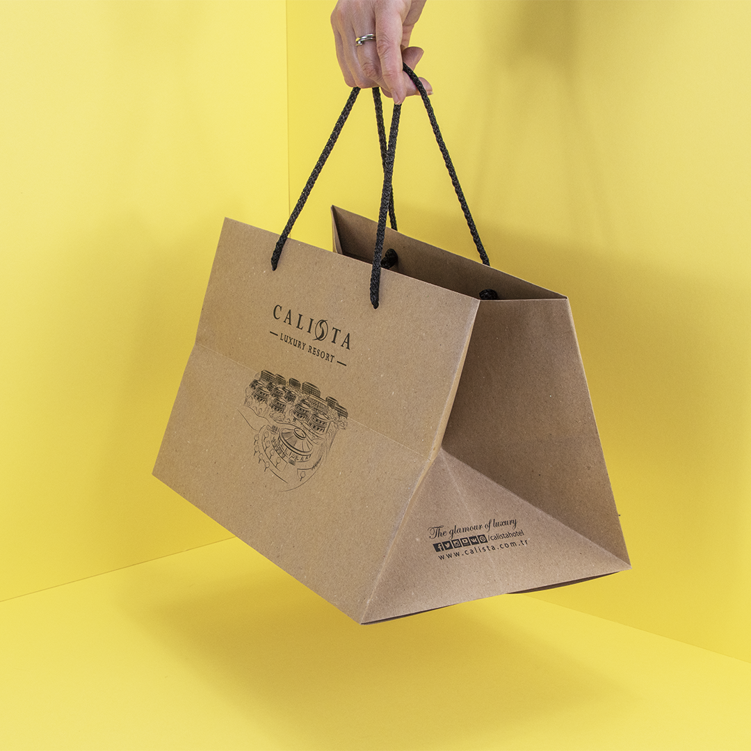
Have a think about keeping it simple.
An effective way to make your takeaway packaging stand out from the crowd is to strip back your packaging.
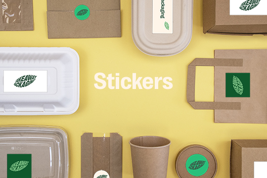
Consider simple paper-wrapping techniques fastened and sealed with a sticker featuring a strong logo.
Stickers can be custom designed with your logo and the simplicity of the packaging will seem intriguing in its modesty and harks back to a more traditional approach to packaging takeaway food.
If you’ve got some ideas that you’re not sure of or you’re looking for inspiration to build on an already outstanding packaging concept then get in touch with our in-house design time who will be happy to bounce some ideas around and offer some advice.