How to Design Packaging for a Subscription Service
subscription service design

Something which comes up an awful lot in the packaging channels of this world, is how best to design packaging suited to a subscription service.

Given our love of all things design and packaging, we thought we’d share some core tips on the sorts of things you need to consider about your packaging designs.

Using the example of a box, this will range from the dimensions of the box to the type of box used.

We follow with some pointers around graphic design and also cover the often overlooked aspect of enhanced advertising.

Many businesses will tell you that it’s often very easy to get carried away with the design elements of a new packaging idea.

While it’s fundamental to the success of a brand’s image and perception, it’s not all about design – choosing the right style and size of the box can hugely impact your profitability.

Subscription service gift

Size Matters – Think Inside The Box

Make sure you’re clear on exactly what will be going in the box or packaging each time you send it and try to use as small a box as possible.

This will help you in a number of ways:

Lower costs on manufacturing and materials (namely cardboard).

A smaller box, and subsequently a reduction in the weight of the box, leaves more allowance for weight of the items themselves, resulting in lower overall shipping costs.

Client retention: customers will perceive the contents to be of greater value – the smaller the box, the fuller it seems

Whereas, if your box is too big and there’s too much space for your products, it will seem underfilled.

In cases where you need to send larger packaging to accommodate an anomaly item, go for two!

Even with two on the odd occasion, you’ll find that you still achieve a saving on your shipping costs – 11 months smaller box and 1 month two boxes.
subscription service items

What’s Your Style?

There are a lot of factors to consider here:

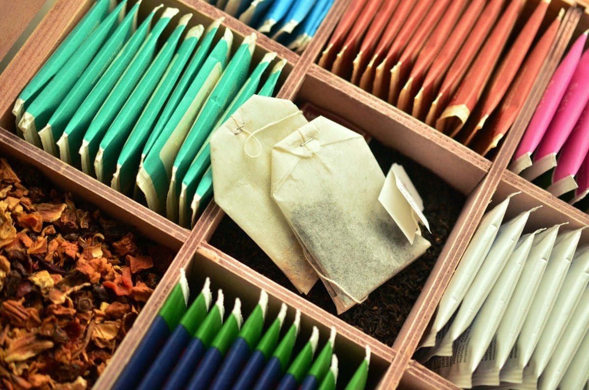
Is your box suitable to ship as it is, or will you need a secondary box to ship it in?

What about the style?

Keep in mind your budget here: 2-piece trays tend to give an impression of higher quality but this might mean you need to use a secondary shipping box – increasing your shipping costs.

On the other hand, tuck-fold closures are great for rapid production. You can cut down on labour and packing time by packing in advance.

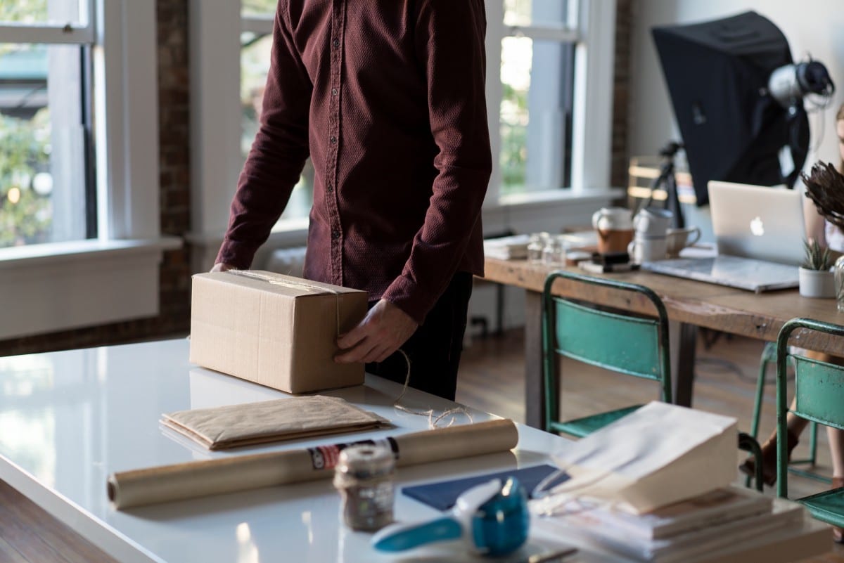
One great tip is to use the shipping label as the securing tape.

Holding on to the pennies? Then the classic stock box aka one-piece folder cut-out might be the right option for you.

However, if you want a custom, non-stock shape then you may find you need to purchase the box-shape-cutter itself, once you’ve had it made.
Office subscription service

Think Outside The Box

The best way to think of your box is as a piece of directly mailed advertising with a 100% engagement rate!

It’s like sending an email you know is going to be opened.

This is your opportunity to sell through your packaging.

It’s completely up to you what elements you include, whether calls to action, offers or incentives.

Think social media sharing prompts, upsell offers or refer a friend options as great ways to increase sales.

Whatever it is, remember to test and measure.
subscription service design

Graphic design & Artwork

Creating your own artwork is extremely rewarding but equally time consuming and difficult to do if you want a really professional finish.

If you don’t have an in-house graphic designer, then don’t despair!

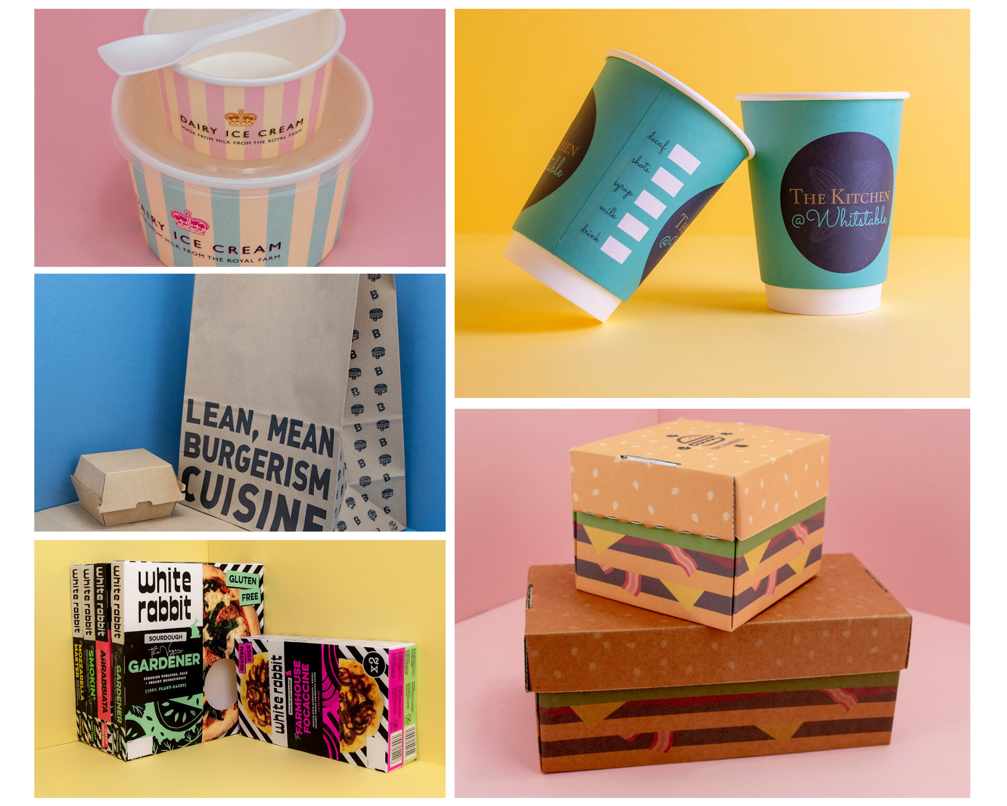
We have a team dedicated to designing and producing fully bespoke, personal designs that are the perfect representation of your brand.

Generally speaking, on the graphic design and printing front, the more varied and full of colour your design, the more it’ll cost to print.

Using laminate coverings can create a very clean cut finish suited to more premium-styled packages.

Stay aware of the different features, forms and styles as these will either hurt or boost your bottom line in different ways!
Subscription service art design

Partner Up!

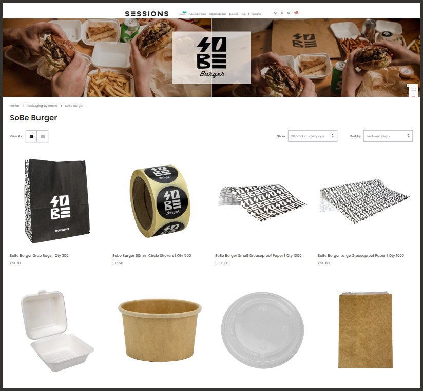
At Takeaway Packaging we provide a completely custom packaging service to suit any brand.

With our packaging and design expertise alongside our legendary joke-telling and enviable good looks, we make the perfect partner for your subscription packaging service.

To find out much more about the options available, drop us a line and let’s chat!
Weird and Wonderful Packaging Designs
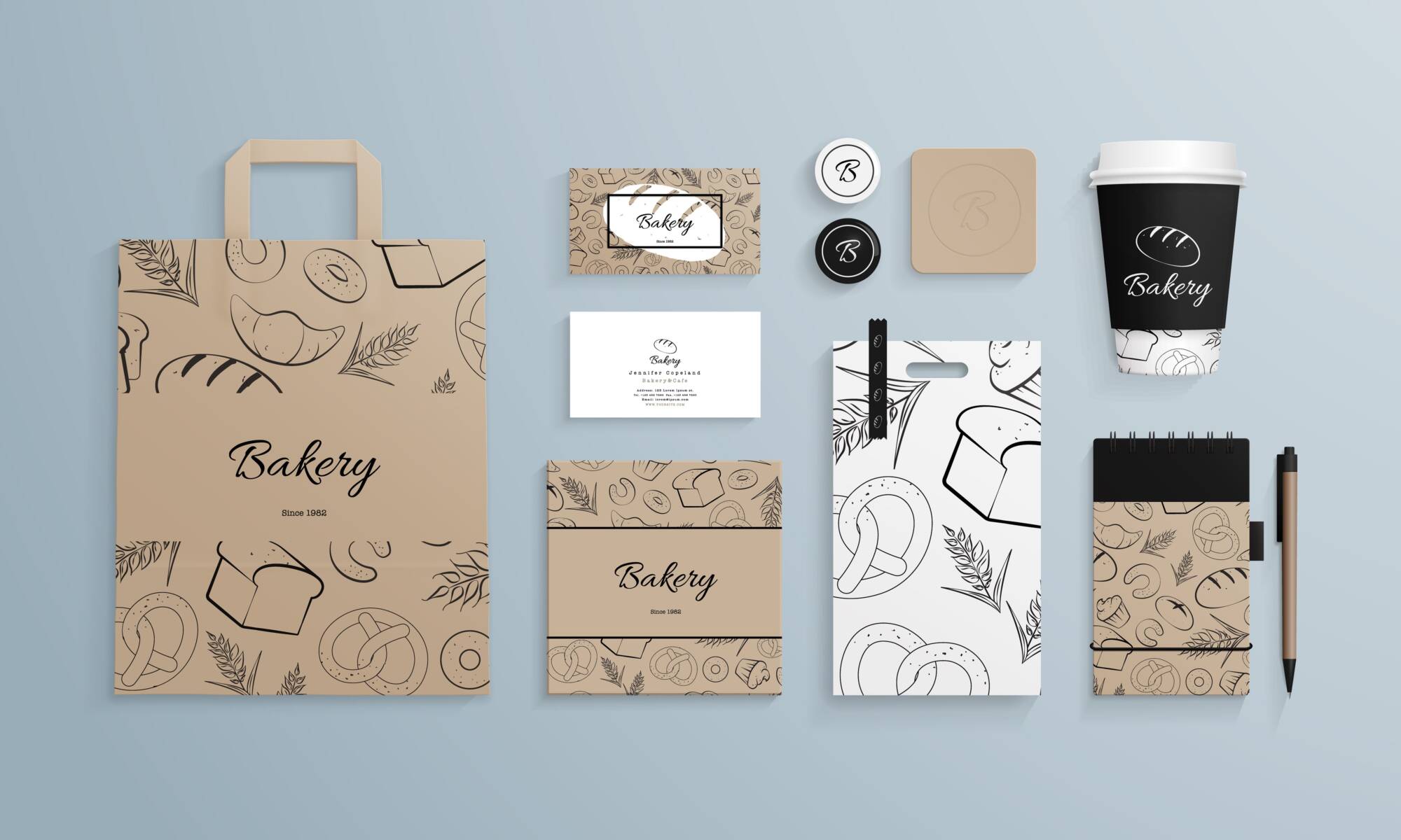
Corporate identity template set with pattern of baked goods. Business stationery mock-up with logo sample. Set of paper bag, cup, cards etc. Vector illustration.

Along with a lot of things in life, like people and potatoes, takeaway packaging comes in many different shapes and sizes.

Sometimes weirdness and oddities are fun and exciting.

Other times, unusual designs can turn out to be ground-breaking and super practical.

Sadly, it is also true that some takeaway packaging is just bonkers and simply ugly.

If you haven’t already guessed, we’ve gathered some examples of the above, so what follows is a candid analysis of takeaway packaging: the good, the bad and the ugly!


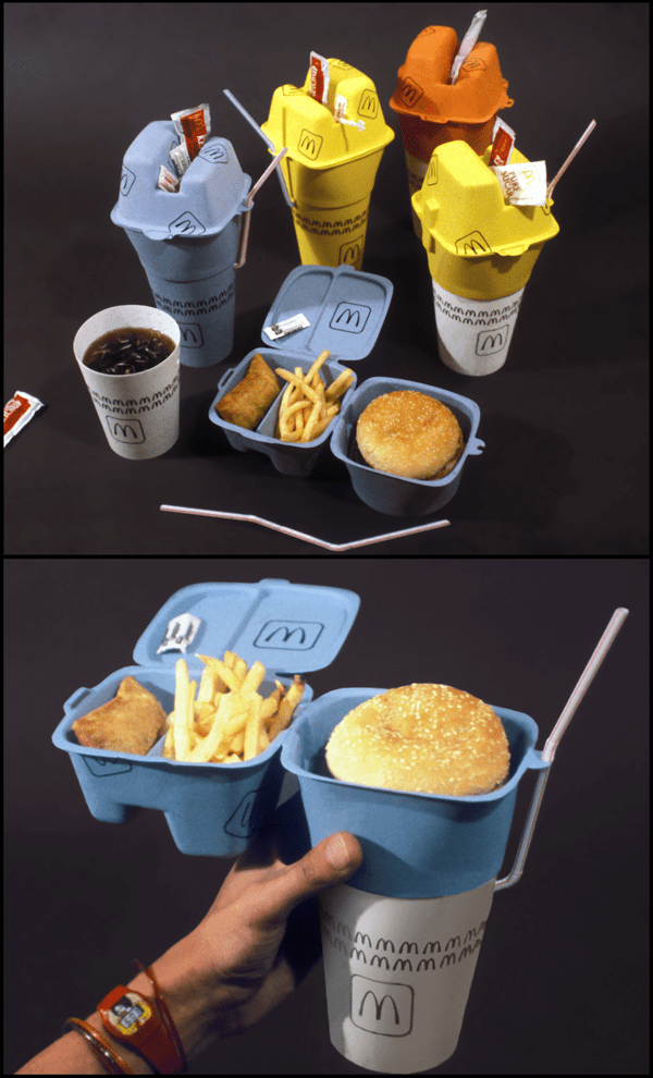
McDonalds Stack Box 4/10

Not everything that’s inspired is a good idea and nor is it guaranteed to take off.

This new Mcdonald’s concept meal packaging is one of those…

mcdonalds packaging

We can see where the designer is going with this one, but, really, it seems to be trying too hard.

The sachets balancing on top are stressful and precarious at best and, essentially, we feel that there is too much that can go wrong with the stacked up top-heavy design.

A commendable design, but we think: just stick to a recyclable paper bag!


Scottish Munchies Box 5/10

Let’s be honest, there’s a whole host of things to do in the world that are no good for us, but by Jove we’ll do ‘em!

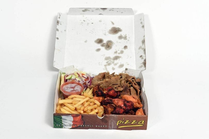
This wonderfully artisanal creation from our Northern neighbours is no exception to the host of guilty pleasures and ill-advised pastimes that we all secretly love, and what’s more, the innovative use of takeaway packaging to accommodate such a dark masterpiece is, well, inspired…

May we present to you, The Munchies Box!

Munchies packaging

What’s in it? Everything.

One pizza box, filled with everything (including cheesy chips and kebab meat).

We were a little divided on scoring this one but concluded that Scotland’s Munchies Box gets 5/10; 10 points for being so brazen and unabashed but -5 points for the terribly ugly packaging.


Hand-held Pie Packaging 8/10

You can’t go far wrong with something that’s really simple.

What you see is what you get with this top-notch pie packaging.

Pie packaging

It’s a cardboard sleeve that finishes in a nice semi-circle on each side to compliment the circular shape of the pie, but it doesn’t stop there!

Those very same semi-circle-shaped ends are actually flaps which fold right back on themselves to enable the eater to get stuck in straight away!

Of course, pies tend to be about a few degrees above scolding for roughly 3 hours, but once the wait is over, you’re away.

Recyclable, easy to serve in, easy to eat from, nice.


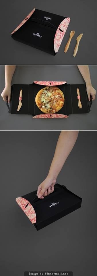
Pizza Plate 10/10

Now this we love!

Pizza packaging

And here’s 5 reasons why:

  1. Pizza is great
  2. It folds flat which means you don’t have to rest your wrists on the corrugated and harsh edges of a traditional not-flat pizza box.
  3. It’s got little cutlery holders which are adorable and very practical, because;
  4. Greasy fingers are not great.
  5. It folds up into a perfect carry case which is stylish and easy to hold.

Top marks for Pizza Plate.


Tuna Burger Box 7/10

This next packaging design concept scores quite high on our list.

As mentioned previously, we’re fans of keeping it simple.

Tuna burger packaging

An honest, cardboard box is tricky to criticise and, particularly where burgers are concerned.

The box aspect is greatly suited to catching any falling debris and burger goodness which means you don’t have to worry about being shunned by your pals if you go in for the ‘5 second rule’, but they don’t!

What makes this design especially enjoyable is the decoy writing on the side.

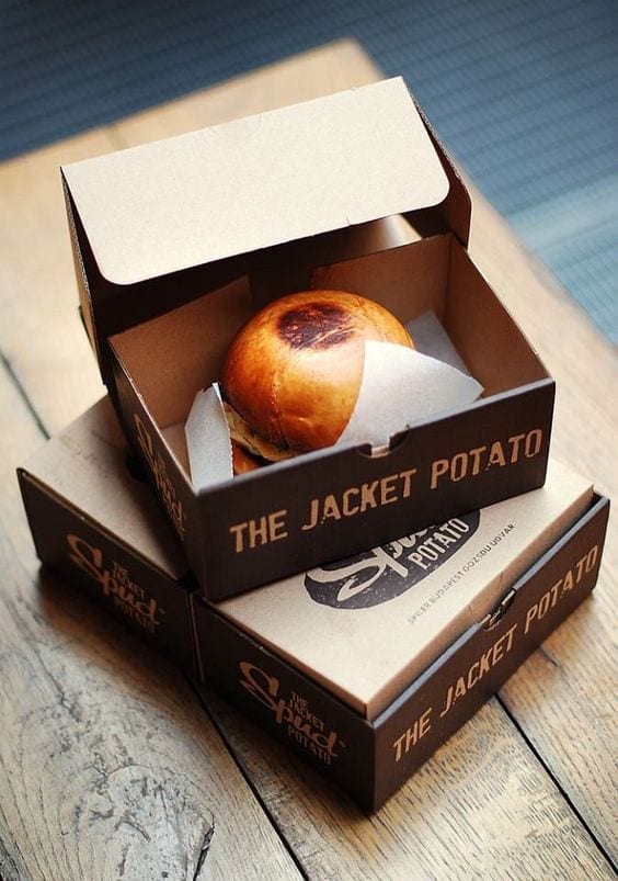
Most people think they’re getting a jacket potato, when in fact, they open up the simple box and BOOM! It’s a tuna burger!


Paper Cup Tea Holder 3/10

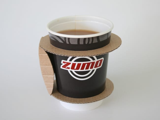
This tea holder does not fill us with confidence.

tea holder packaging

It would be great if you wanted to look as British as possible while drinking from a takeaway cup, because you can hold it like a china cup with your pinky finger extended and sip away dandily.

However, as a heat guard, we can’t understand why the traditional sleeve needs changing.

It doesn’t look study and we’re not convinced that the dainty looking holder has that ‘grab a coffee and go’ feel to it.

Here’s another thing I bet you hadn’t thought of: whose cup holder can accommodate that shape!?

We think this design is ‘over egging the pudding’ somewhat and the humble, yet sturdy and effective, heat sleeve ought to be left to doing the fine job that it does.


If you’re considering standing out from the crowd or shaking up the packaging status quo in your town, then give our team a call about custom design.

How to make your packaging stand out from the crowd
Starbucks packaging

The Starbucks logo is a globally recognised icon and one which surrounds the household name.

A familiar face to crowded high streets with a calming-green background, it’s undeniable that Starbucks coffee cups stand out from the crowd… or is it?

Is it really fair to say that a plain white cup with a green logo jumps out of any picture or view and meets your eye instantly?

Probably not.

What is true, is that when you do see that green logo with the siren/maiden/lady thing, it’s unmistakably ‘Starbucks’.

Last December, and piloted initially in the US, Starbucks launched a packaging campaign so great they gained the highest number of video views that season for their campaign advert:

Over 76 million views in under 1.5 months!

They beat all other brands across the whole period of Thanksgiving through to New Year 2018!

How?

They made their already iconic cup unusual and exciting.

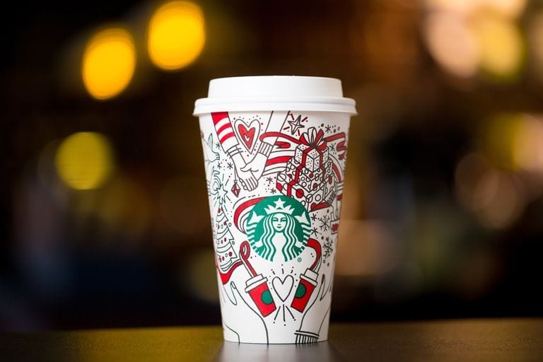
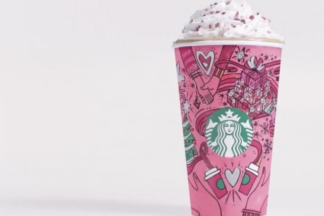
Starting with an initial concept for the design of the holiday-season coffee cup, the cup featured seasonal, warming outlines of images of Christmas and merriment; wrapped presents, snowflakes and coca, all nestled around the Starbucks logo.

Starbucks pink packaging
Credit: Starbucks

Their short video, below, simply explained that you can “make the holiday your own” then featured the newly designed cup changing colours – you design your own!

The cups in the advert feature all different colour schemes, vibrant and bold.

Even if the cups were coloured in terribly, they would be an object of humour and still likely standout.

Artists and within-the-lines-perfectionists would have really gone for it, only for the cup to then serve as a work of art and, you guessed it, free, ‘boosted’ advertising for Starbucks!

The campaign ticked all the boxes for the consumer; interaction and engagement with the product/brand, something different, something exciting (adults get to be big kids), and most of all, something personal.


Top Tips For Standout Packaging

As with Starbucks, doing something different to other people similar to you, will go a long way towards making you standout.

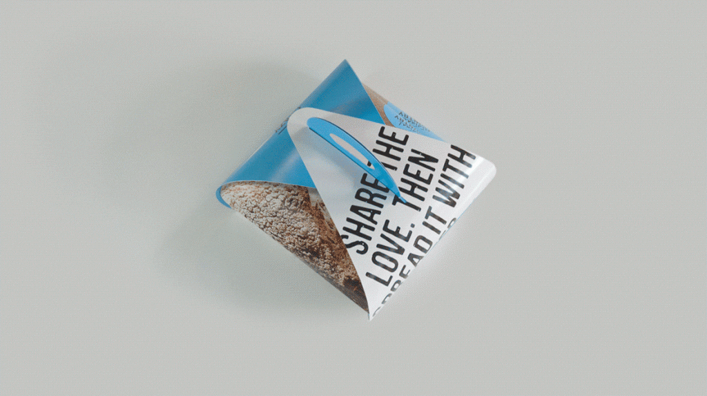
Though no longer trading, Californian-based bakers The Crazy Good Bread Co, are an example of a company whose packaging stood out because it was unusual:

standout bread packaging

Doing something slightly ‘against the grain’ will help you to get your packaging noticed, and that includes packaging your bread in a weird card holder thing.

Staying ahead of the curve is another way for your packaging to to stand out.

At a time when environmental concerns have never been higher, ensuring that you fully embrace the green/eco-friendly approach to waste and packaging will serve you really well.

Given that there are many, many businesses yet to do so, you will establish your brand as a conscious and progressive company that listens to its customers and considers carefully its own ethos and attitudes – this is a powerful consideration that certainly doesn’t go unnoticed.

Have a think about keeping it simple.

An effective way to make your takeaway packaging stand out from the crowd is to strip back your packaging.

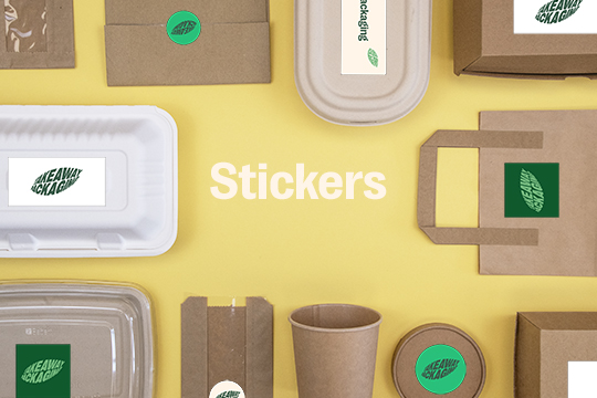
Consider simple paper-wrapping techniques fastened and sealed with a sticker featuring a strong logo.

Stickers can be custom designed with your logo and the simplicity of the packaging will seem intriguing in its modesty and harks back to a more traditional approach to packaging takeaway food.


If you’ve got some ideas that you’re not sure of or you’re looking for inspiration to build on an already outstanding packaging concept then get in touch with our in-house design time who will be happy to bounce some ideas around and offer some advice.

World Environment Day 2018 | Our Favourite Products
World Enviroment Day - Takeaway Packaging

We hope you all had a great World Environment Day. To celebrate, we have rounded up our top eco-friendly products – not limited to takeaway packaging! All of these products are future friendly and sustainable, let us know your thoughts. #TakeawayPackagingForChange

#1 EcoCup by Ecoware (available for pre order*)

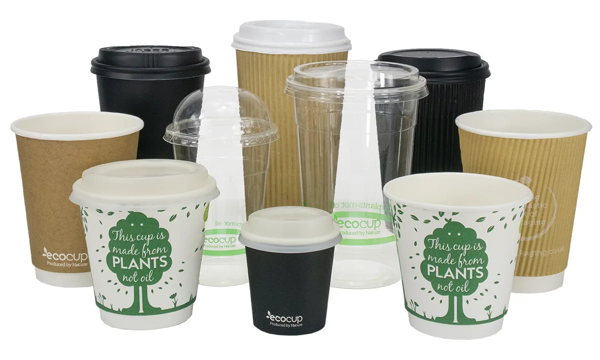
This range of double wall paper cups by Ecoware is fully biodegradable, recyclable and compostable – and they look great too! We are now the sole UK distributor for Ecoware products, so if you’d like to purchase these – get in touch with us.

Ecoware EcoCups - Takeaway Packaging

#2 Allbirds Footwear – Comfort That Grows on Trees

Tim Brown had a vision to create shoes produced from natural resources – and he did just that! He teamed up with Joey Zwillinger, an engineer, to create a revolutionary wool fabric made just for footwear.
The footwear is made from…

  •  The Shoe: The material is produced from Wool, a process that uses 60 percent less energy than producing synthetic shoes.
  • The Lace: A pair of laces are created from one recycled plastic bottle.
  • The Packaging: Their packaging is made from 90 percent recycled cardboard.

Their tree fibre, “TENCEL™ Lyocell” is sourced from South African farms that use minimal fertiliser and are reliant on rainfall. Compared to materials such as cotton, it uses 95 percent less water, cutting their carbon footprint in half!

#3 Recycled Plastic Rugs by Fab Habitat

“Our company works diligently to create beautiful and affordable products for your home décor while keeping the most important aspect of our mission in mind – reducing carbon footprint on the environment.”

Fab Habitat specialise in creating indoor & outdoor homeware products made from recycled plastics.

Takeaway Packaging - Fab Habitat Eco Rug

These rugs are woven from recycled plastic drinking straws! Not only are they affordable, all products are coated with UV Protection and tested under harsh sunlight to ensure they do not fade. The majority of their products are made from plastic to help keep the harmful material out of landfill.

#4 D4R by iameco

The D4R laptop by iameco is the first future friendly laptop. When creating this laptop, they focused on the materials of the laptop and manufacturing process to reduce energy consumption and eliminate waste.

Iameco Laptop - Takeaway Packaging

“The goals in developing the laptop were:
1. Achieve a decrease of at least 30% in greenhouse gas (GHG) emissions
2. At least 70% of overall re-use and recycling of waste and
3. Reduction of at least 75% of fresh water utilisation.”

#5 Backpack by Onya

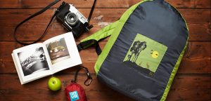
These colourful bags are made from rPET (Recycled Polyethylene Terephthalate) material, which is what you get when you recycle old plastic water bottles into fibre. Each backpack is made from up to 10 plastic bottles.

Features

  • Adjustable Shoulder Straps
  • Practical Handle
  • Zip Up Closure
  • Internal Phone/iPod/Radio Pouch

Like this blog? Read our Environmental Statement here.

Keep up to date by following us on social media
@TakeawayPack on Twitter
@takeawaypackaging on Facebook
@takeawaypackaging on Instagram
Contact Us
Sign up for News & Special Offers

Compostable Food Boxes & Trays Available Now
Takeaway Food Boxes - Compostable - Takeaway Packaging

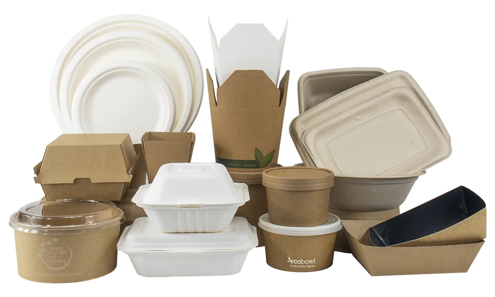
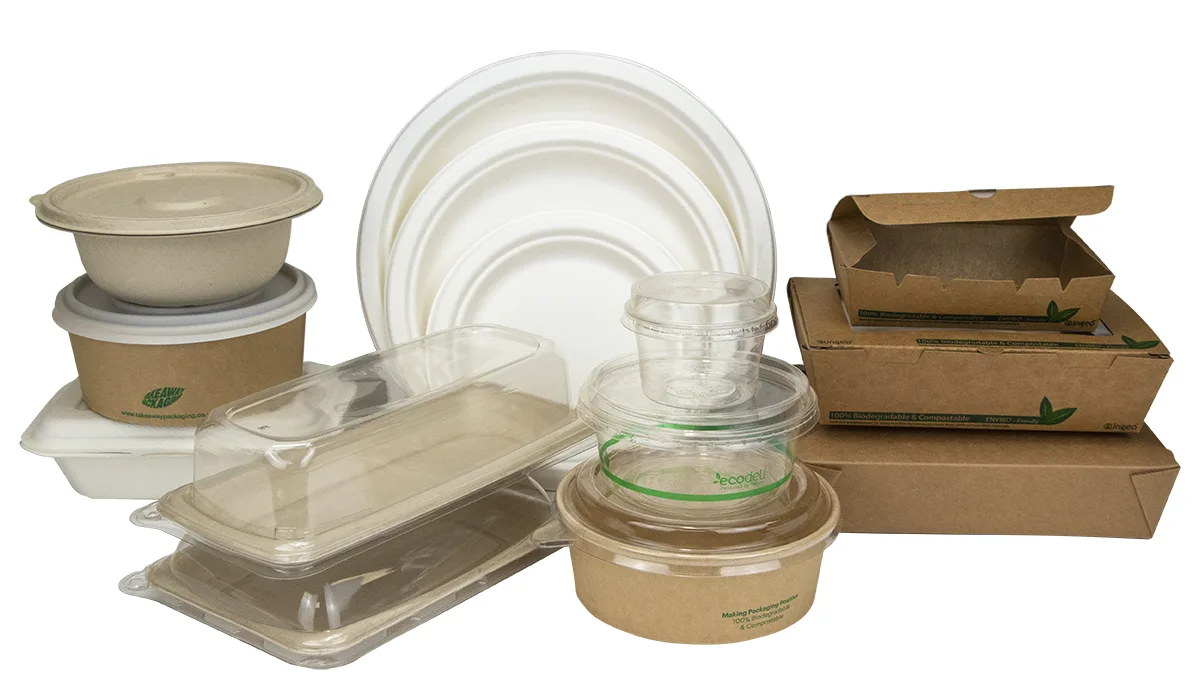
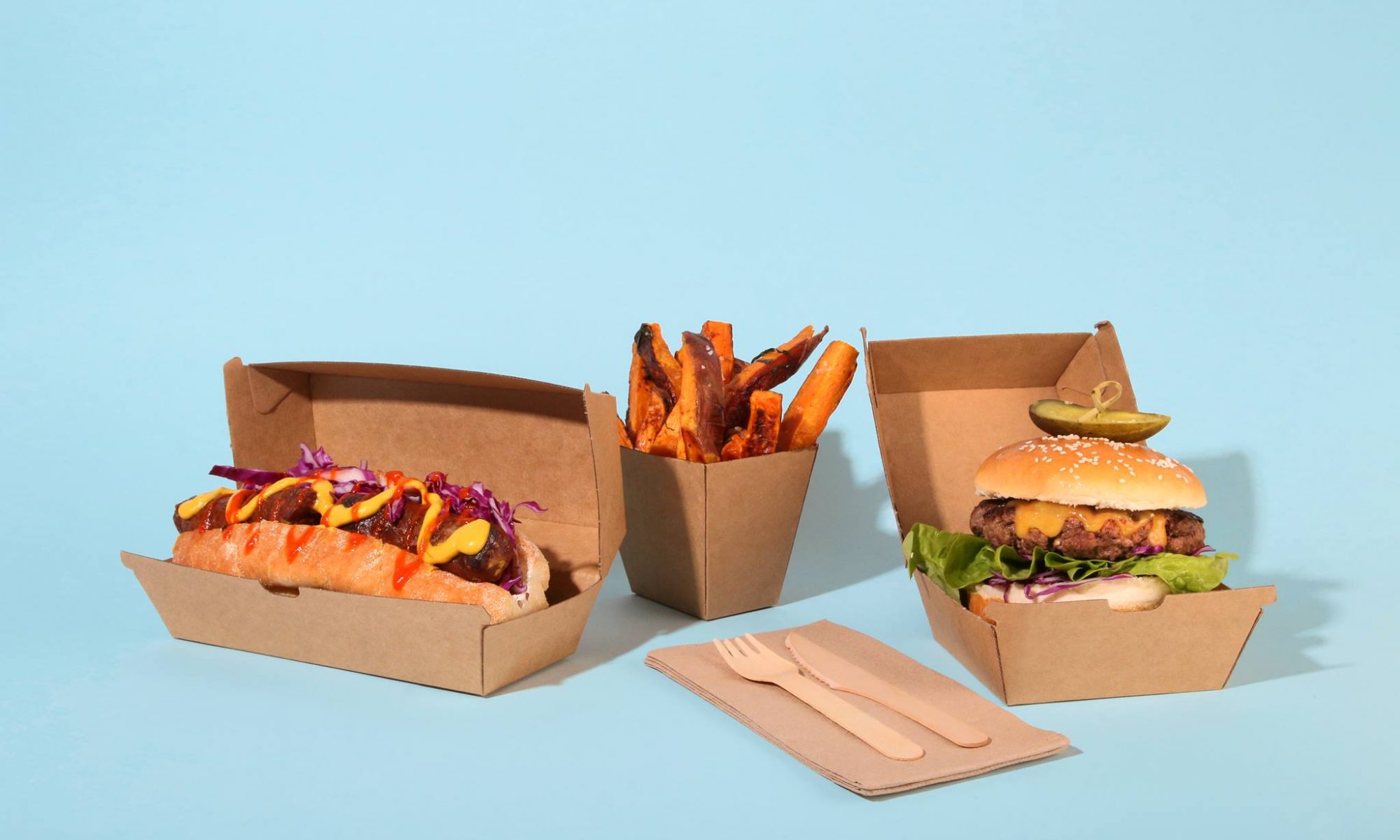
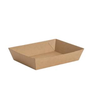
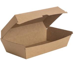
We are excited to share our new range of compostable takeaway boxes with you. These food boxes are made from a sturdy virgin Kraft board and are extremely versatile, being suitable for both hot and cold food.

Products Available
Nested Trays | Long Food Trays | Snack Boxes | Burger Boxes

Can we brand it?
We can brand these boxes with food safe inks. Our talented design team can create bespoke designs tailored to the nature of your business. Find out more about out design services here.

The Material
This Kraft is made from wood pulp, sourced from responsibly managed & sustainable forests. It is manufactured using a unique process to provide a higher durability, making it tear resistant. Products are lined with water resistant, plant based and biodegradable coating. These food boxes and trays can be recycled and are also compostable.

Features

  • Water & Oil Resistant
  • Recyclable and Compostable
  • Suitable for Hot and Cold Food

These products have been tested across a wide range of end of life options, you can find out more about these here. If you’re interested in any of these products, please get in touch with us for more information and to receive your unique quote.

Looking for other products? We are now the sole UK distributor for Ecoware. You can read all about our sole distributorship and view the full compostable range we have available here.

Keep up to date by following us on social media
@TakeawayPack on Twitter
@takeawaypackaging on Facebook
@takeawaypackaging on Instagram